
Redesign Enterprise B2B2C SaaS Platform, Define Atomic Design System, AI Integration

Redesign Enterprise B2B2C SaaS Platform, Define Atomic Design System, AI Integration

Redesign Enterprise B2B2C SaaS Platform, Define Atomic Design System, AI Integration

Who’s Awin?

Who’s Awin?

Who’s Awin?

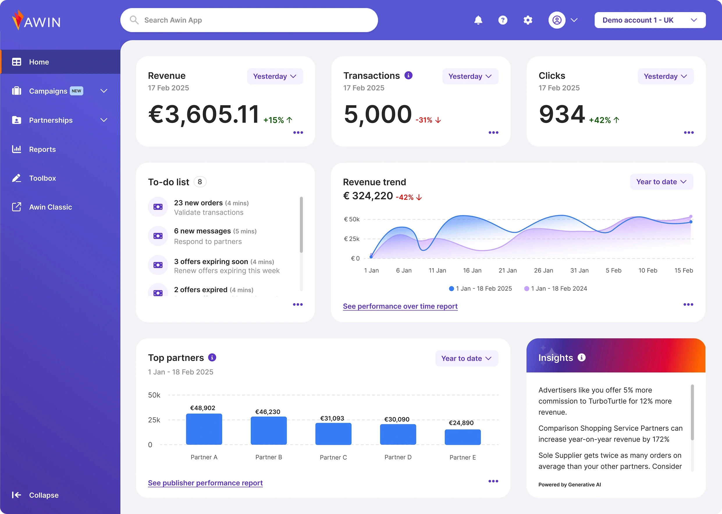
AWIN is one of the world’s largest affiliate marketing platforms, connecting brands, publishers, and partners through a complex ecosystem of data-driven tools.

AWIN is one of the world’s largest affiliate marketing platforms, connecting brands, publishers, and partners through a complex ecosystem of data-driven tools.

The platform powers thousands of partnerships globally and manages large volumes of performance, reporting, and campaign data across multiple markets.

The platform powers thousands of partnerships globally and manages large volumes of performance, reporting, and campaign data across multiple markets.

Context, Scope

Context, Scope

Context, Scope

The Awin ecosystem had grown significantly over the years, resulting in a fragmented experience across the entire product: platform, website, navigation, components, flows, and interactions.


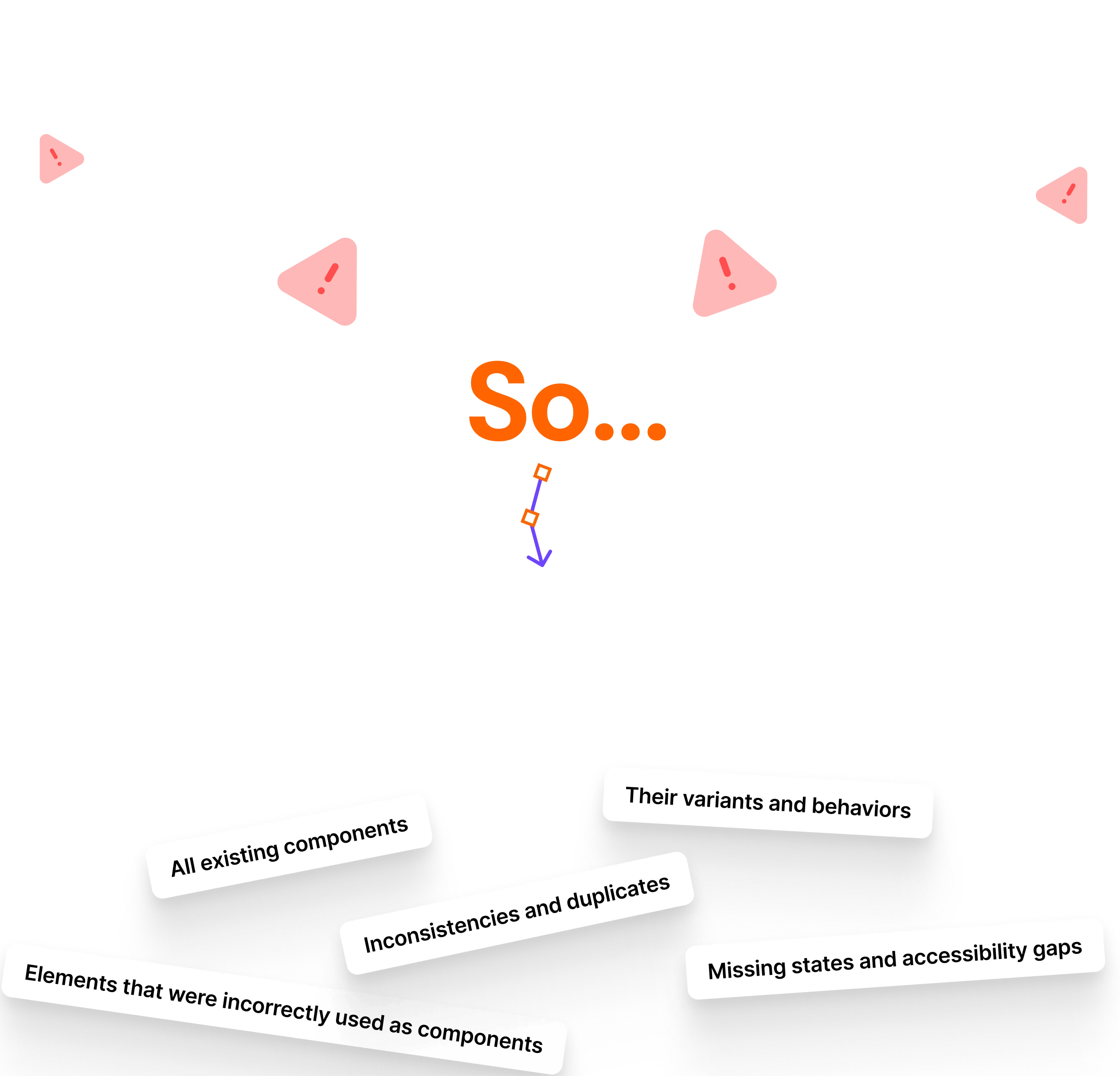
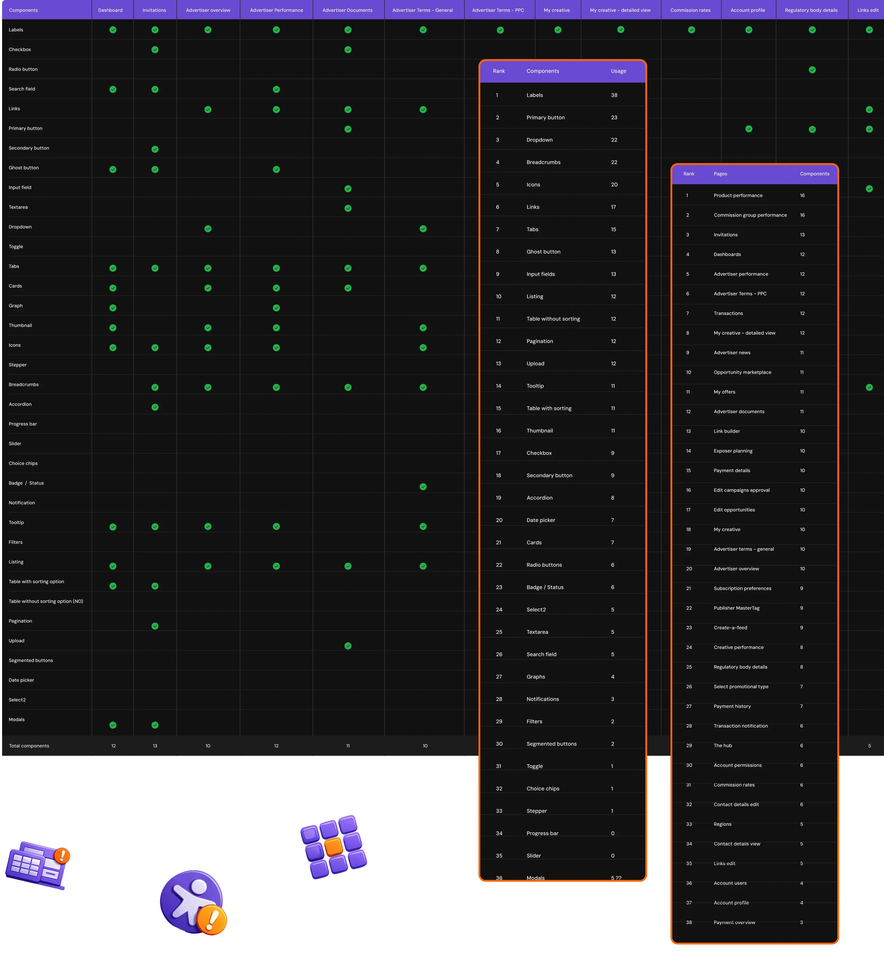
Different teams worked independently, creating their own patterns, UI elements, and terminology. This led to inconsistent behavior, duplicated functionality, accessibility gaps, and an overall lack of alignment in both design and execution.


The goal was to unify the entire experience, create a scalable design system foundation, and redesign the platform to improve usability, clarity, and cross-team collaboration.

The Awin ecosystem had grown significantly over the years, resulting in a fragmented experience across the entire product: platform, website, navigation, components, flows, and interactions.


Different teams worked independently, creating their own patterns, UI elements, and terminology. This led to inconsistent behavior, duplicated functionality, accessibility gaps, and an overall lack of alignment in both design and execution.


The goal was to unify the entire experience, create a scalable design system foundation, and redesign the platform to improve usability, clarity, and cross-team collaboration.

&

&

Objectives

Create a scalable Design System from scratch using an Atomic Design approach.

Create a scalable Design System from scratch using an Atomic Design approach.

Unify visual and interaction patterns across the entire platform and website.

Unify visual and interaction patterns across the entire platform and website.

Redesign the entire platform and improving interaction design.

Redesign the entire platform and improving interaction design.

Improve navigation, usability, and discoverability through structured, predictable UX patterns.

Improve navigation, usability, and discoverability through structured, predictable UX patterns.

Establish a cross-team collaboration workflow between Product, Design, and Engineering.

Establish a cross-team collaboration workflow between Product, Design, and Engineering.

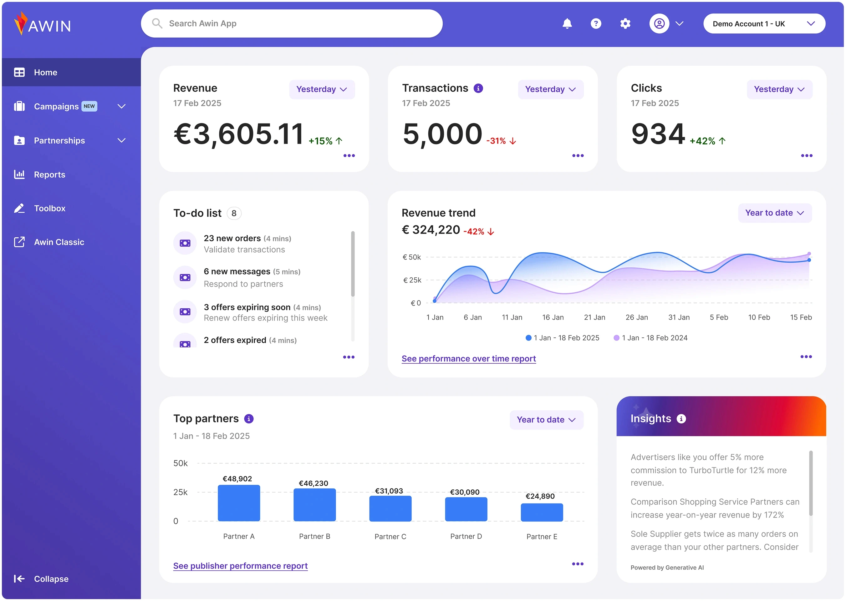
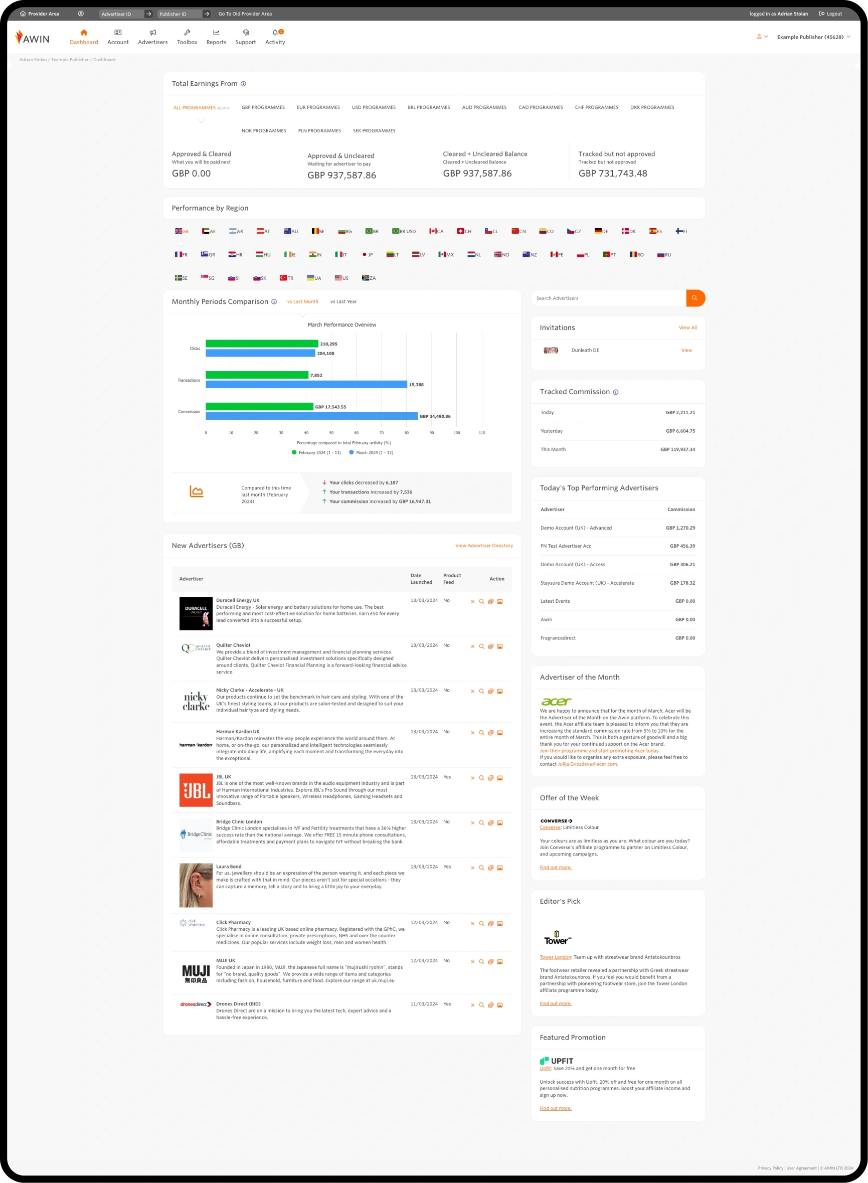
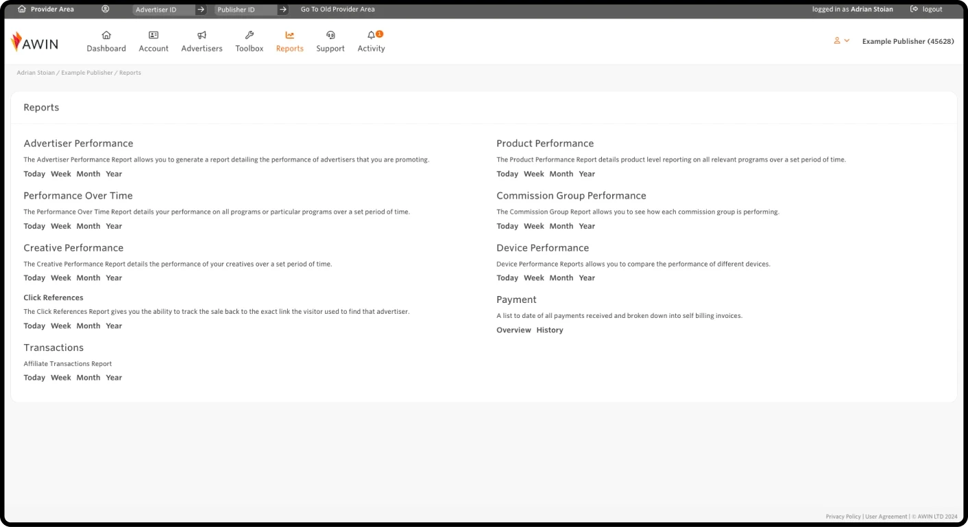
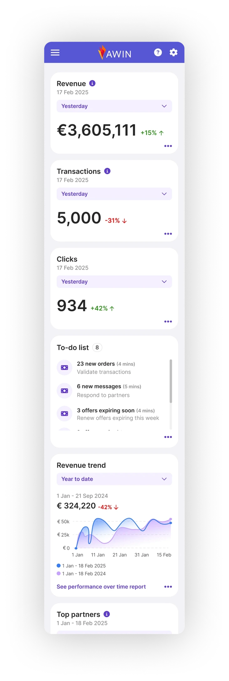
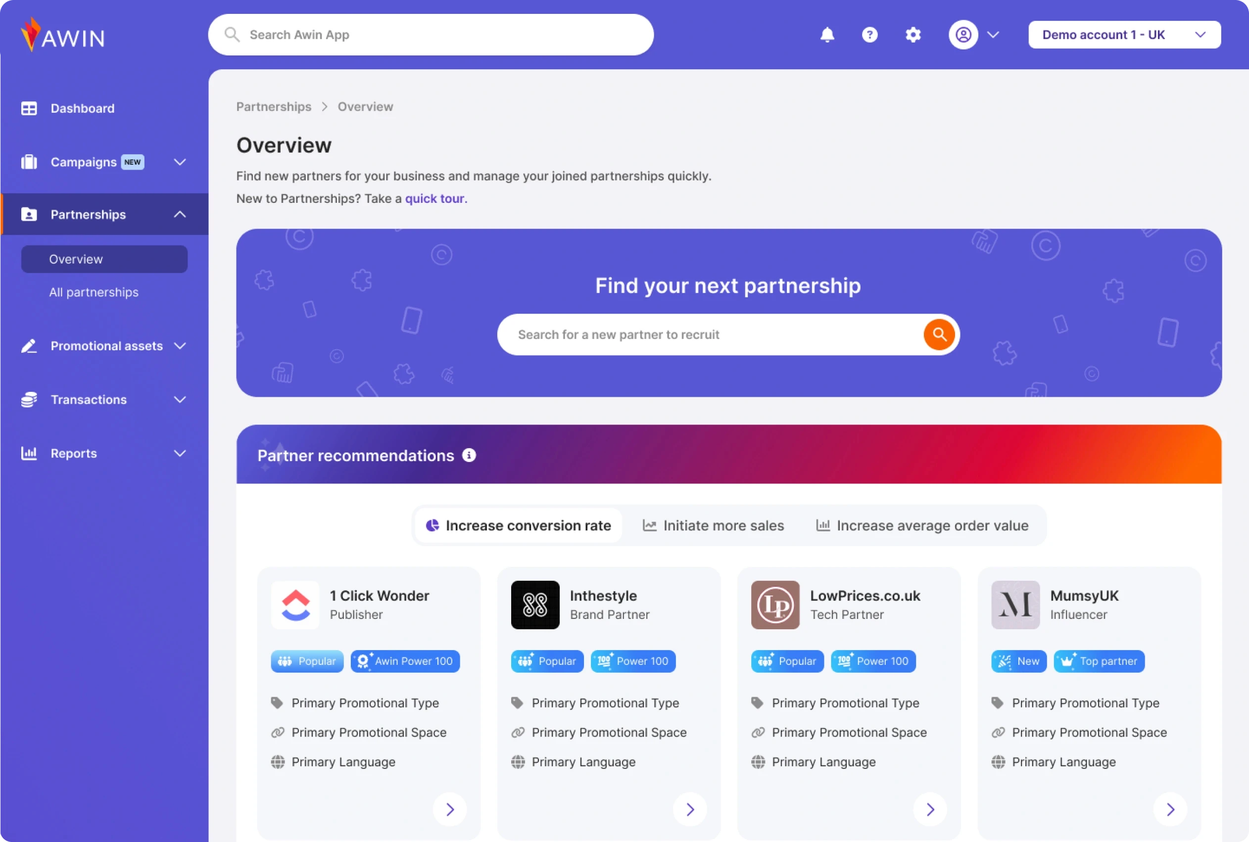
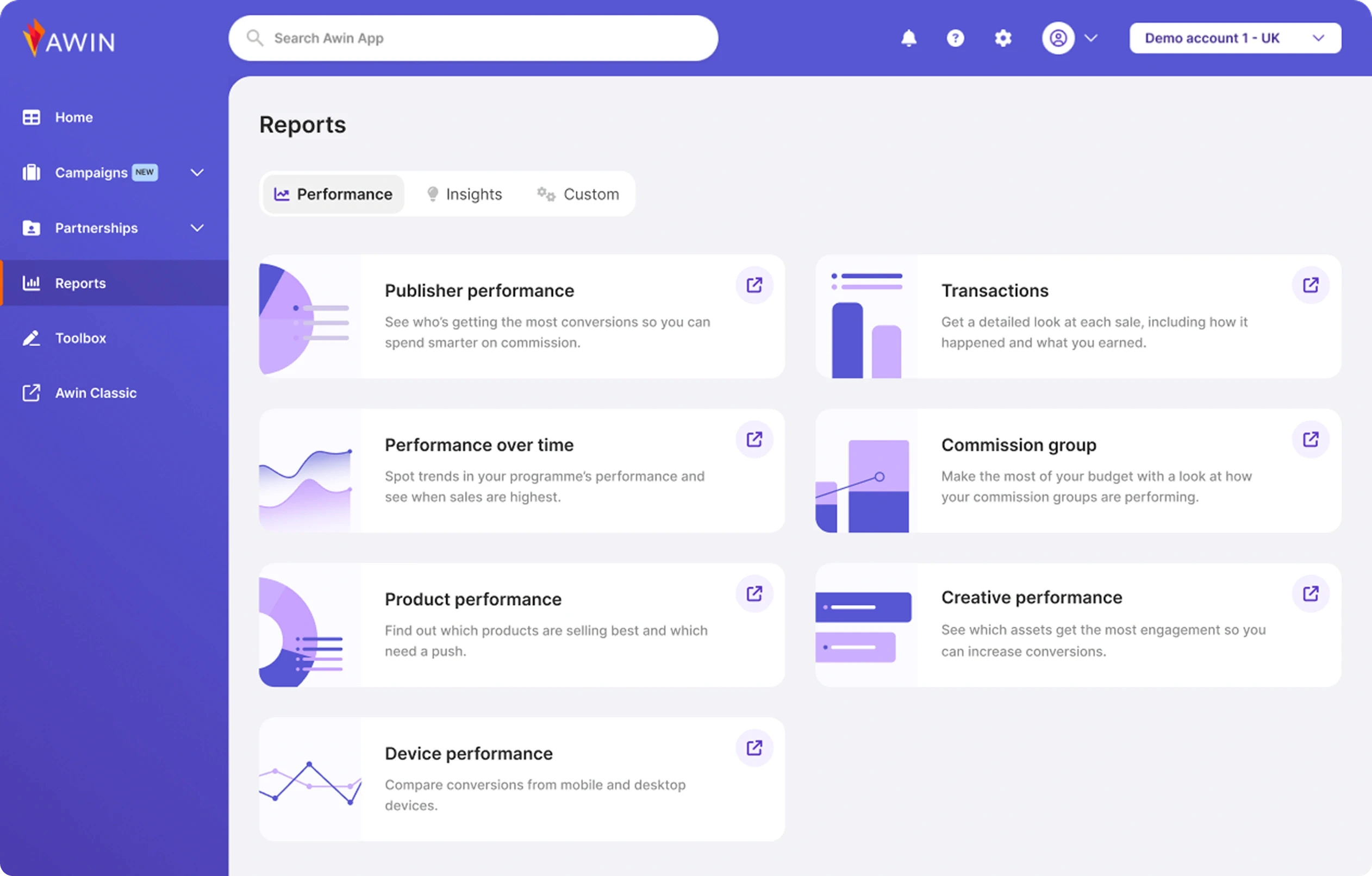
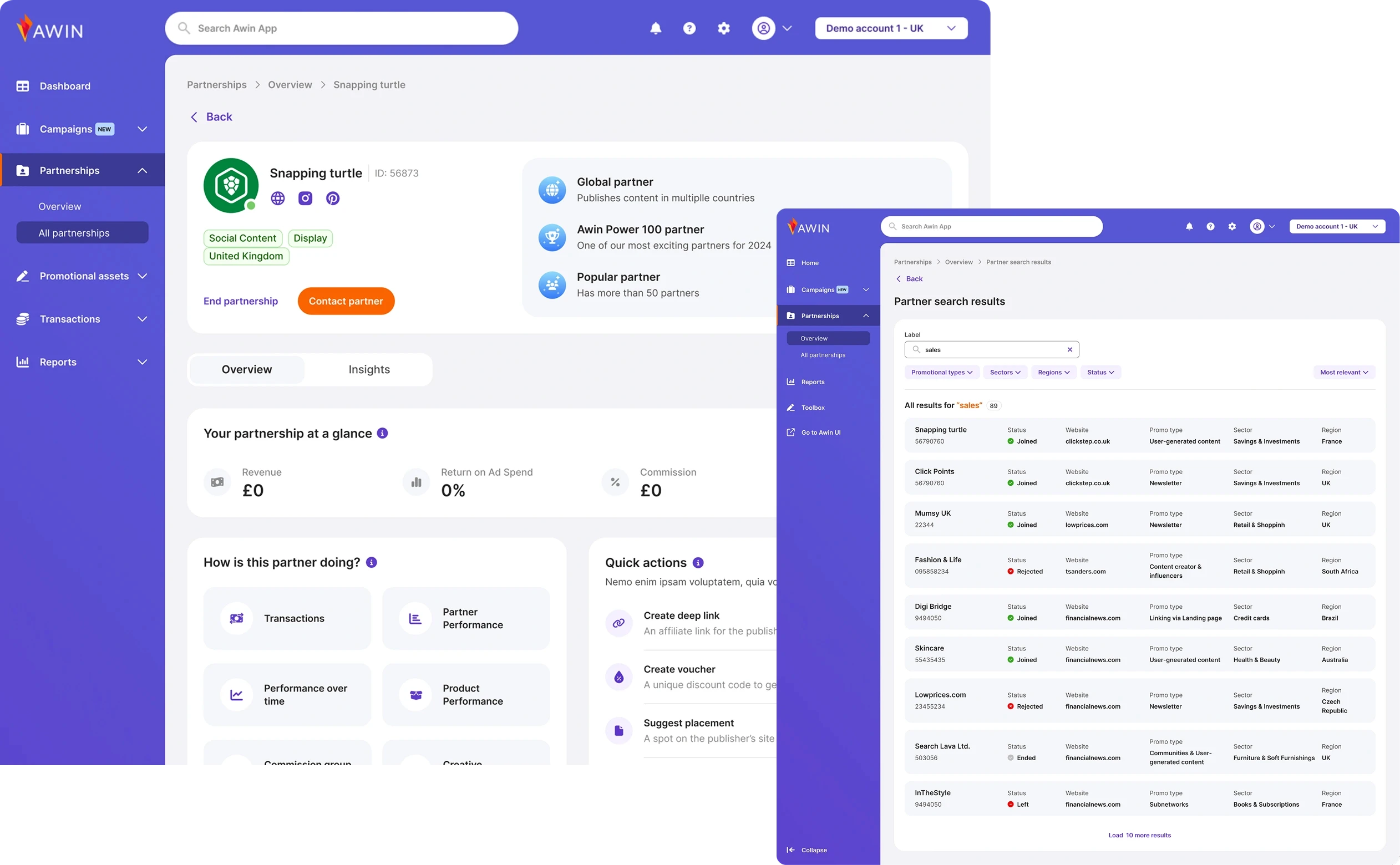
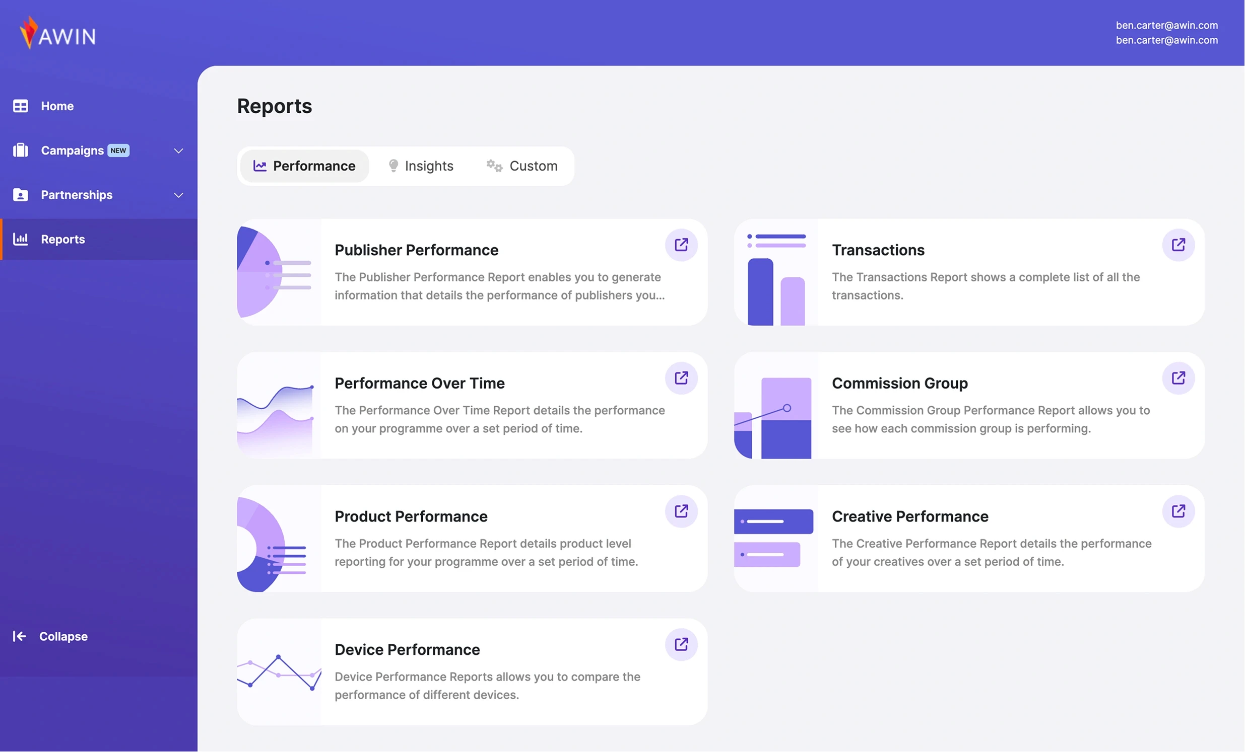
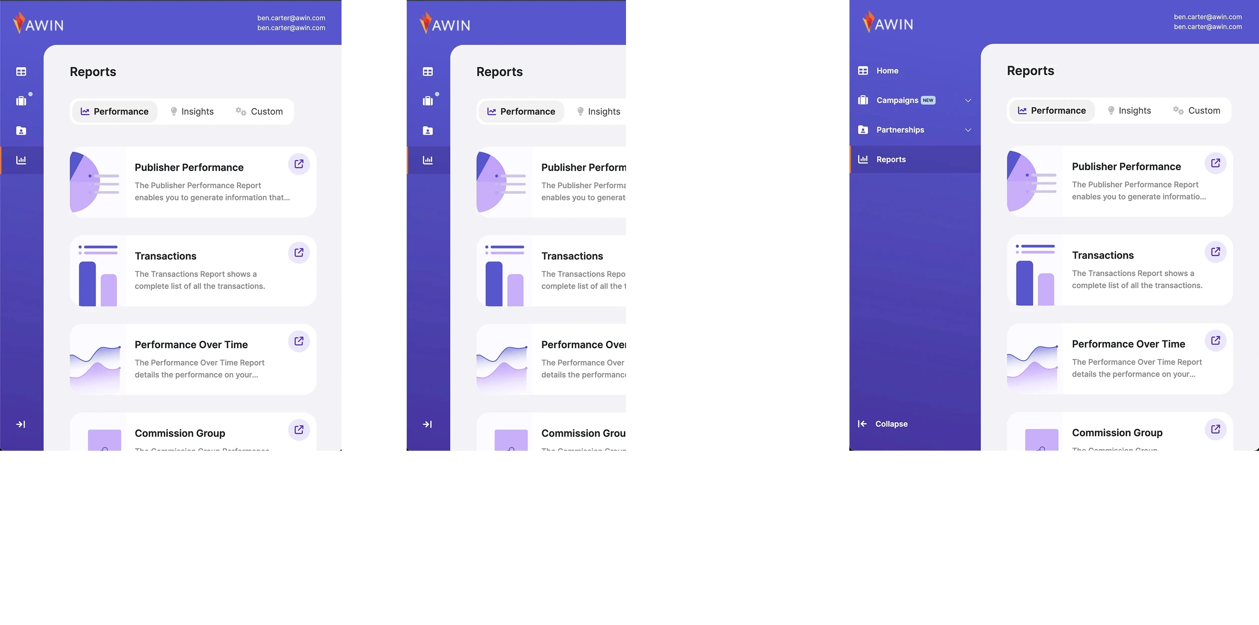
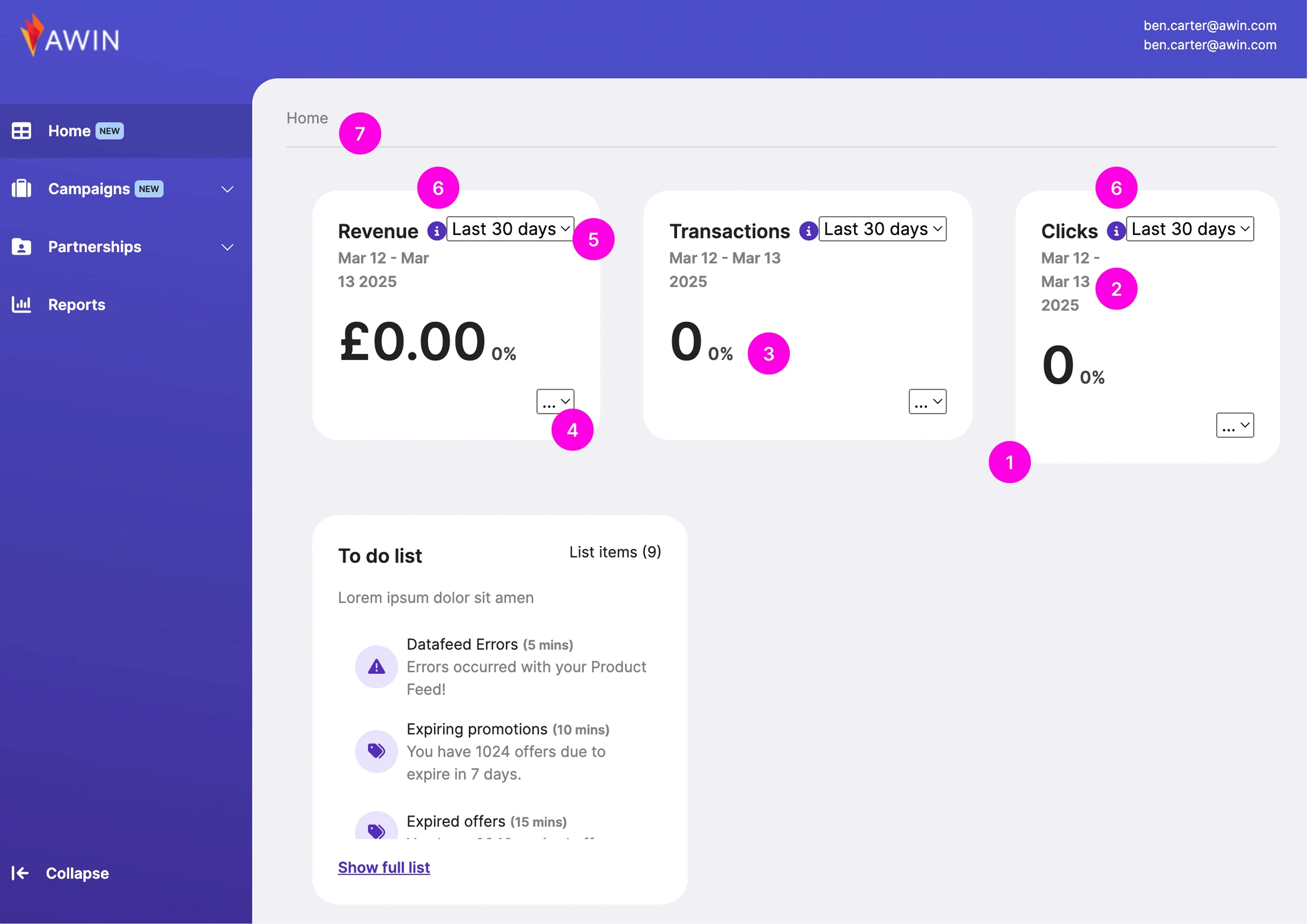
Modernize key product experiences, including Dashboard, Reporting, Commission Manager, Comms Center, and Publisher tools.

Modernize key product experiences, including Dashboard, Reporting, Commission Manager, Comms Center, and Publisher tools.

Improve accessibility and align with WCAG standards.

Improve accessibility and align with WCAG standards.

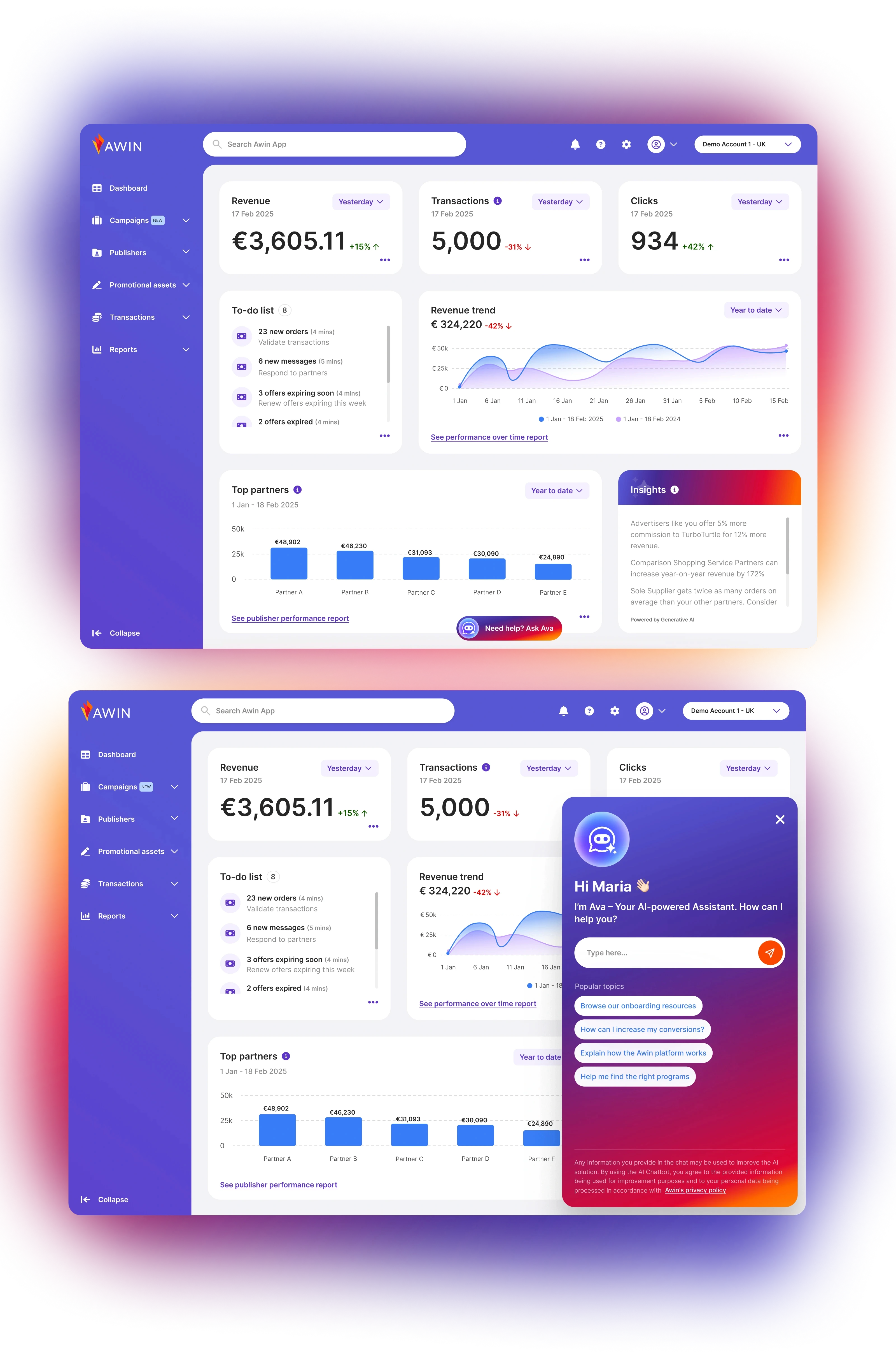
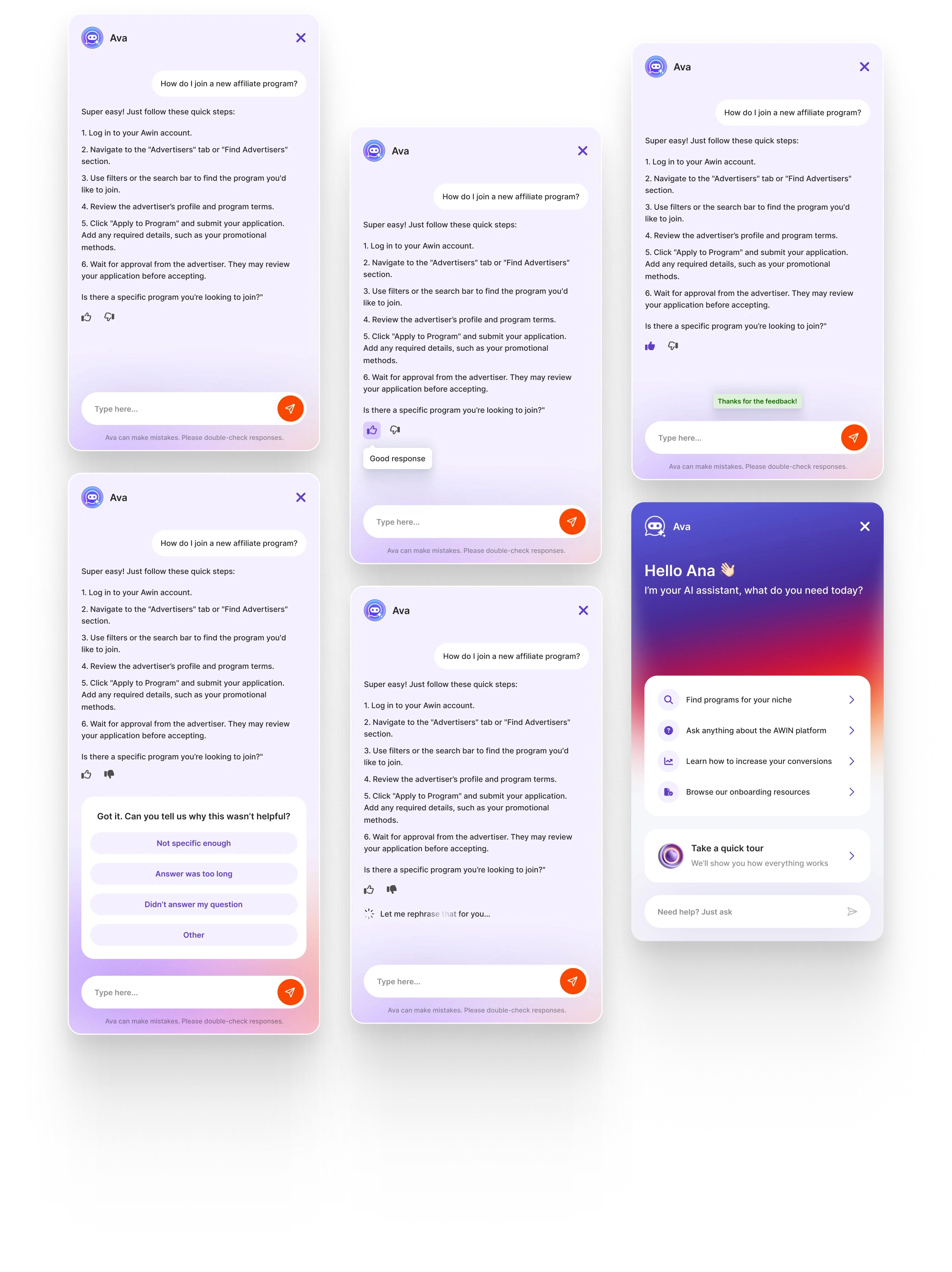
Introduce intelligent, scalable foundations and AI-powered enhancements across key parts of the product.

Introduce intelligent, scalable foundations and AI-powered enhancements across key parts of the product.

Objectives

Objectives

Objectives

Our Role

Our Role

Our Role

Lunis Design Lab led the full redesign of the platform and website, while coordinating a 12-person design team across UX, UI, content, copy, and research.


We created a scalable cross-platform Design System that unified the visual identity, interaction patterns, and accessibility standards across the entire ecosystem.

Design System Creation from Scratch

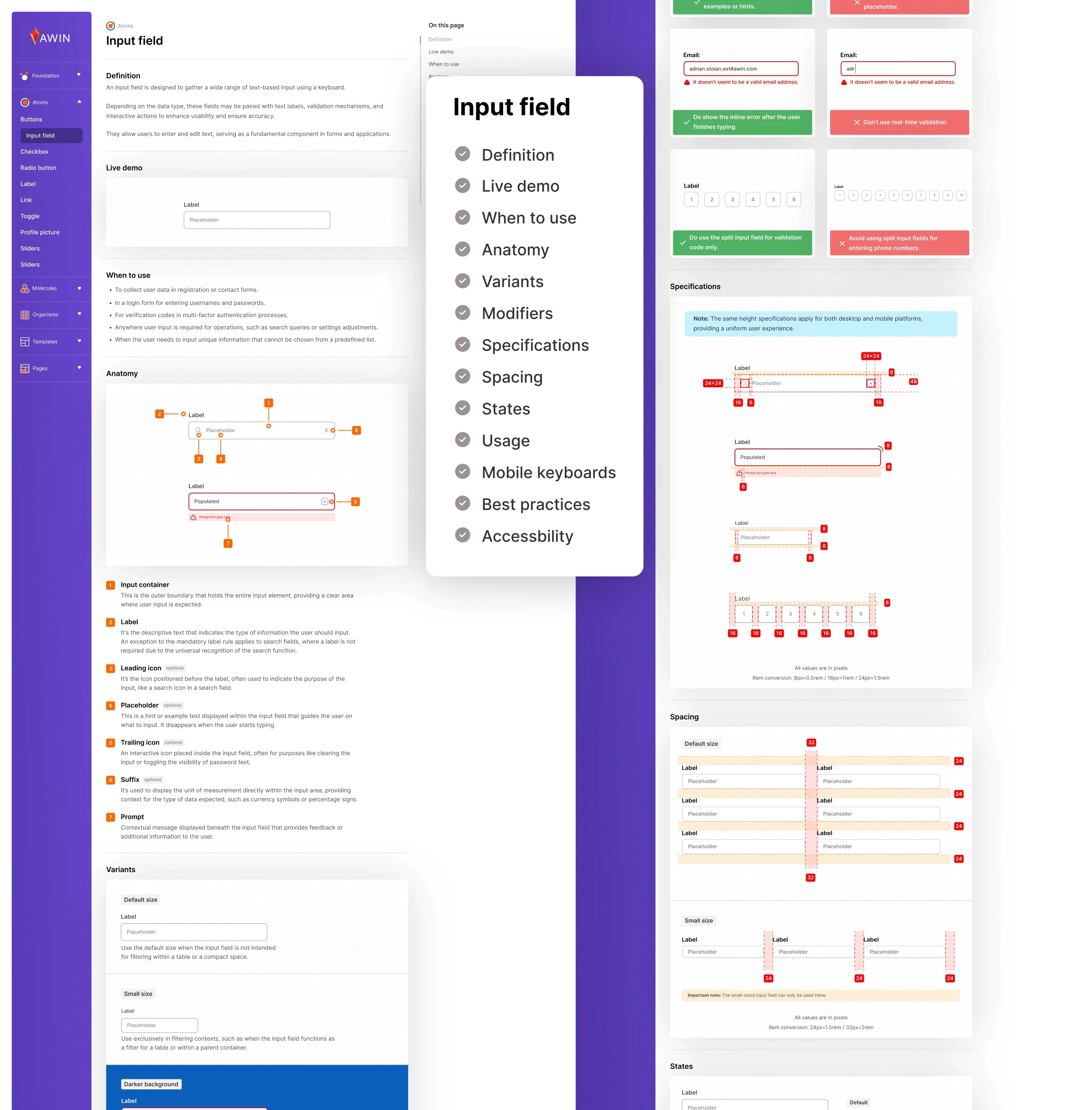
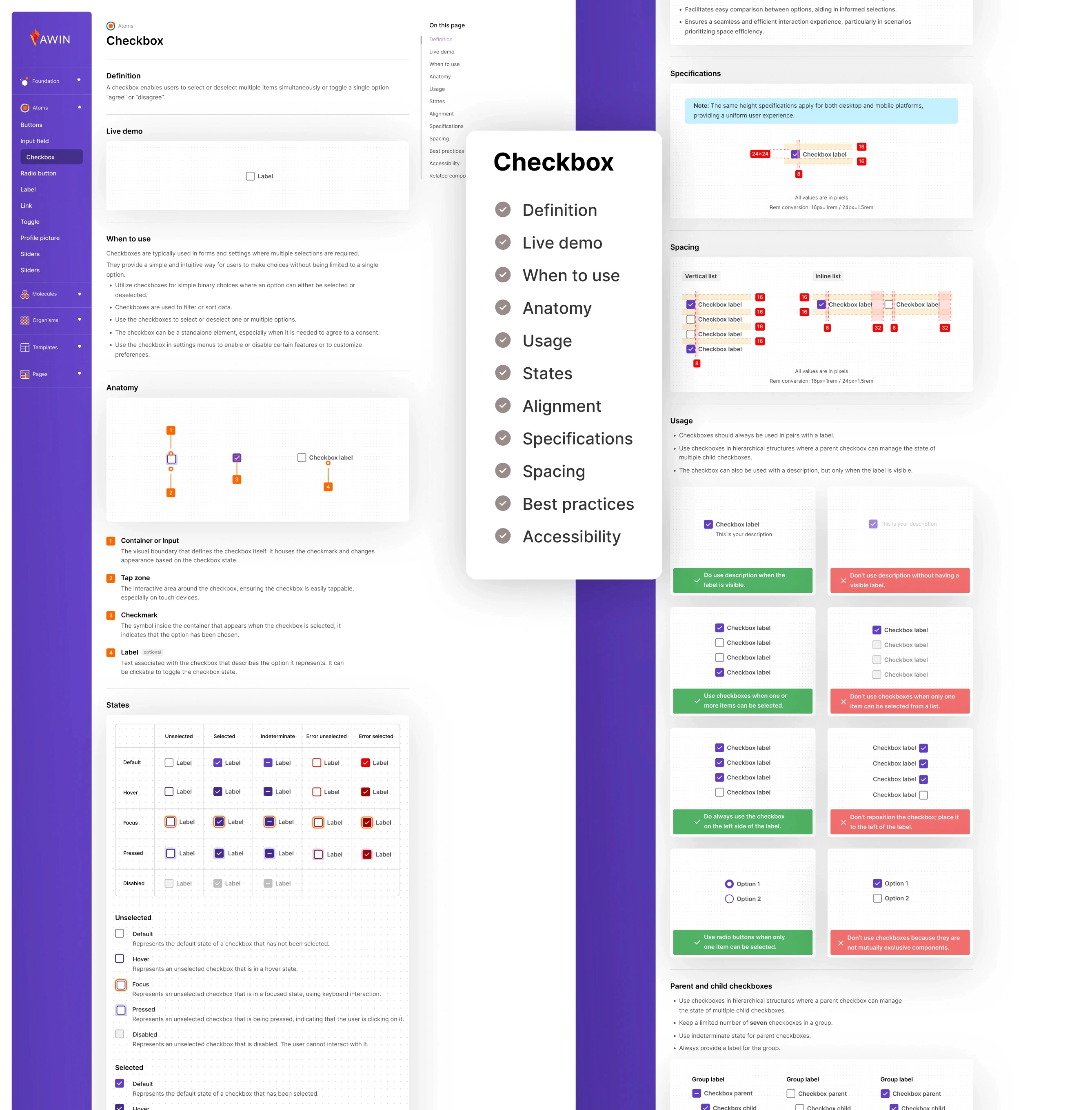
Creating the Design System from scratch, using an Atomic Design approach (tokens, atoms, molecules, organisms).

Full Platform & Website Redesign

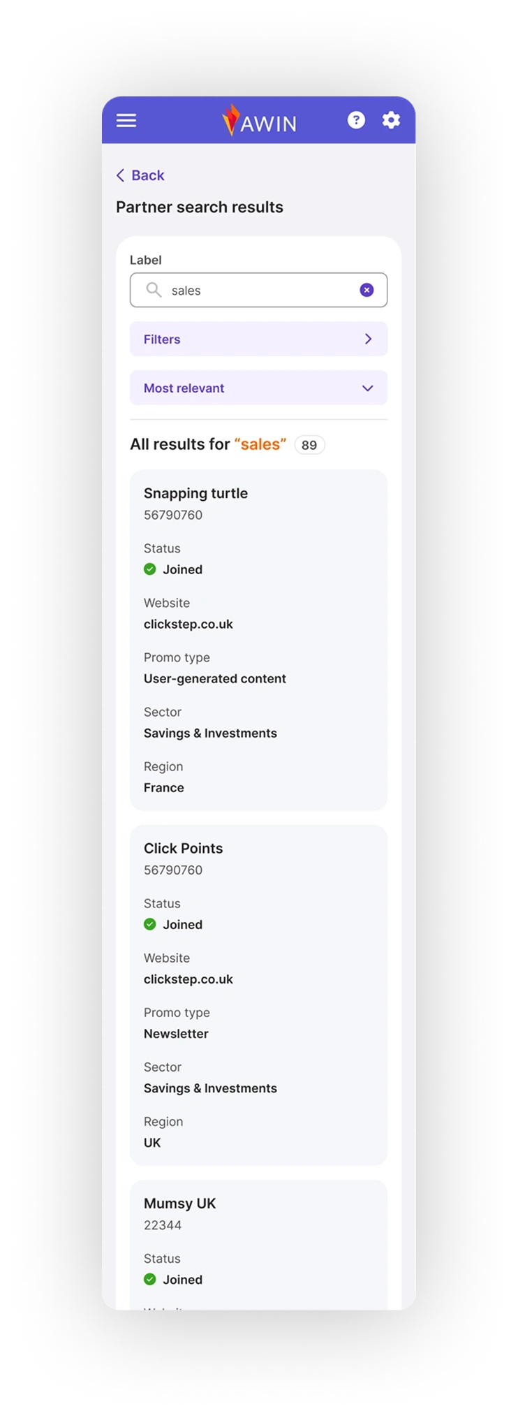
Redesigning the entire platform and its website, aligning all modules under a unified UX and visual direction.

Responsive & Cross-Platform Experience

Creating a fully responsive (PWA) and scalable experience across desktop, tablet, and mobile.

Accessibility & Improvements

Ensuring the platform met AA / AAA WCAG accessibility standards.

Developer Handoff & Implementation Support

Supporting front-end implementation by providing specs, documentation, edge cases, and dev-ready component guidelines.

Interaction Models & Component Behavior

Defining and documenting interaction patterns, component behavior, states, and accessibility guidelines.

To make this possible, Lunis Design Lab facilitated dedicated alignment sessions with all Product Owners, supported the redefinition of their roadmaps, and established a shared design language that enabled teams to work within one unified system.

To make this possible, Lunis Design Lab facilitated dedicated alignment sessions with all Product Owners, supported the redefinition of their roadmaps, and established a shared design language that enabled teams to work within one unified system.

To make this possible, Lunis Design Lab facilitated dedicated alignment sessions with all Product Owners, supported the redefinition of their roadmaps, and established a shared design language that enabled teams to work within one unified system.

Mobile App UX & UI Creation

Designing the mobile app experience to support cross-platform user workflows.

Cross-Functional Leadership

Leading cross-functional alignment with Product Owners, Developers, and Analysis teams.

Design Review & Quality Assurance

Reviewing and approving all design work from the wider design team to eliminate inconsistencies and design debt.

Central UX/UI Point of Contact

Acting as the main point of contact for everything related to UX, UI, Design System, and consistency across teams.

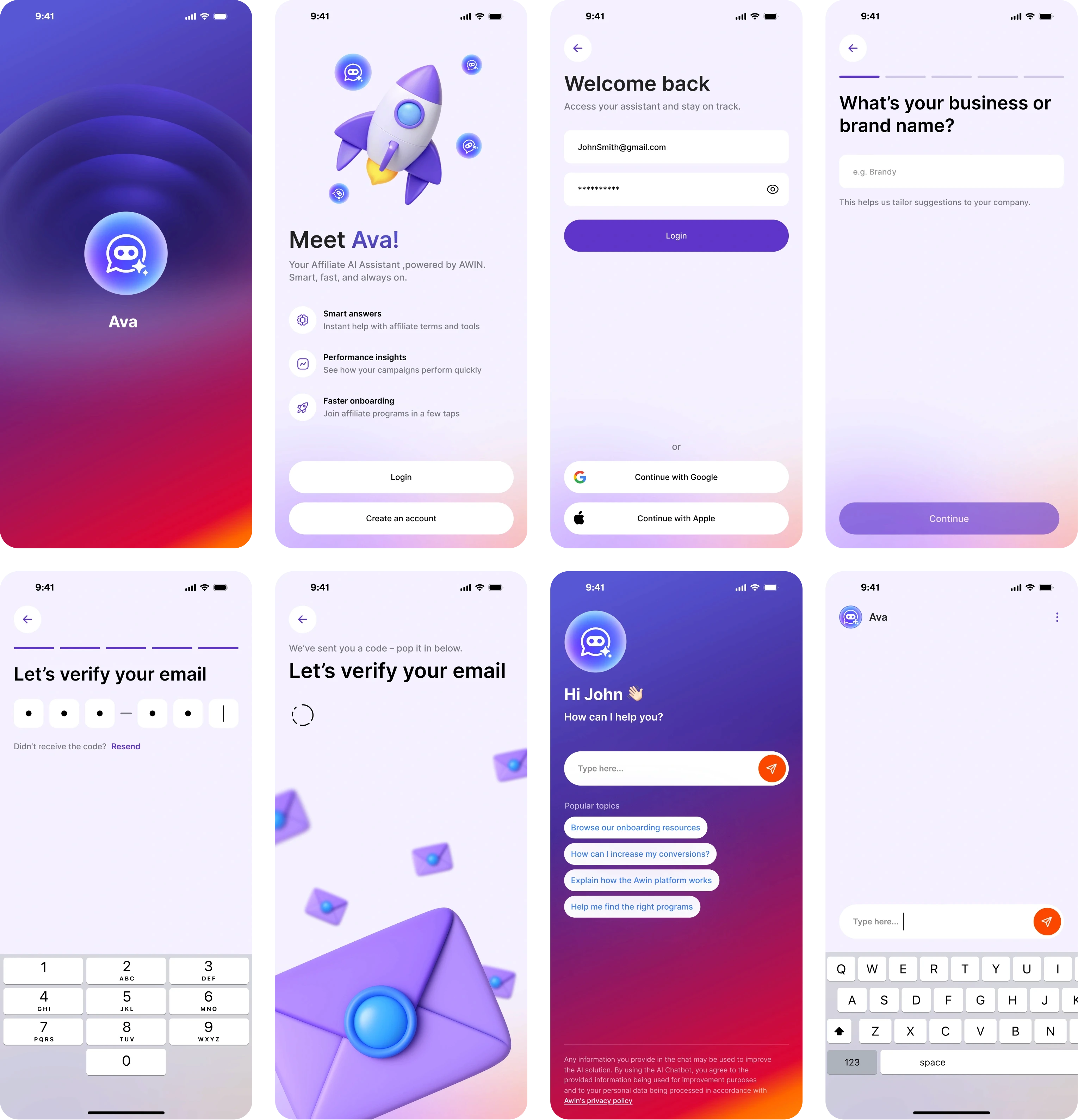
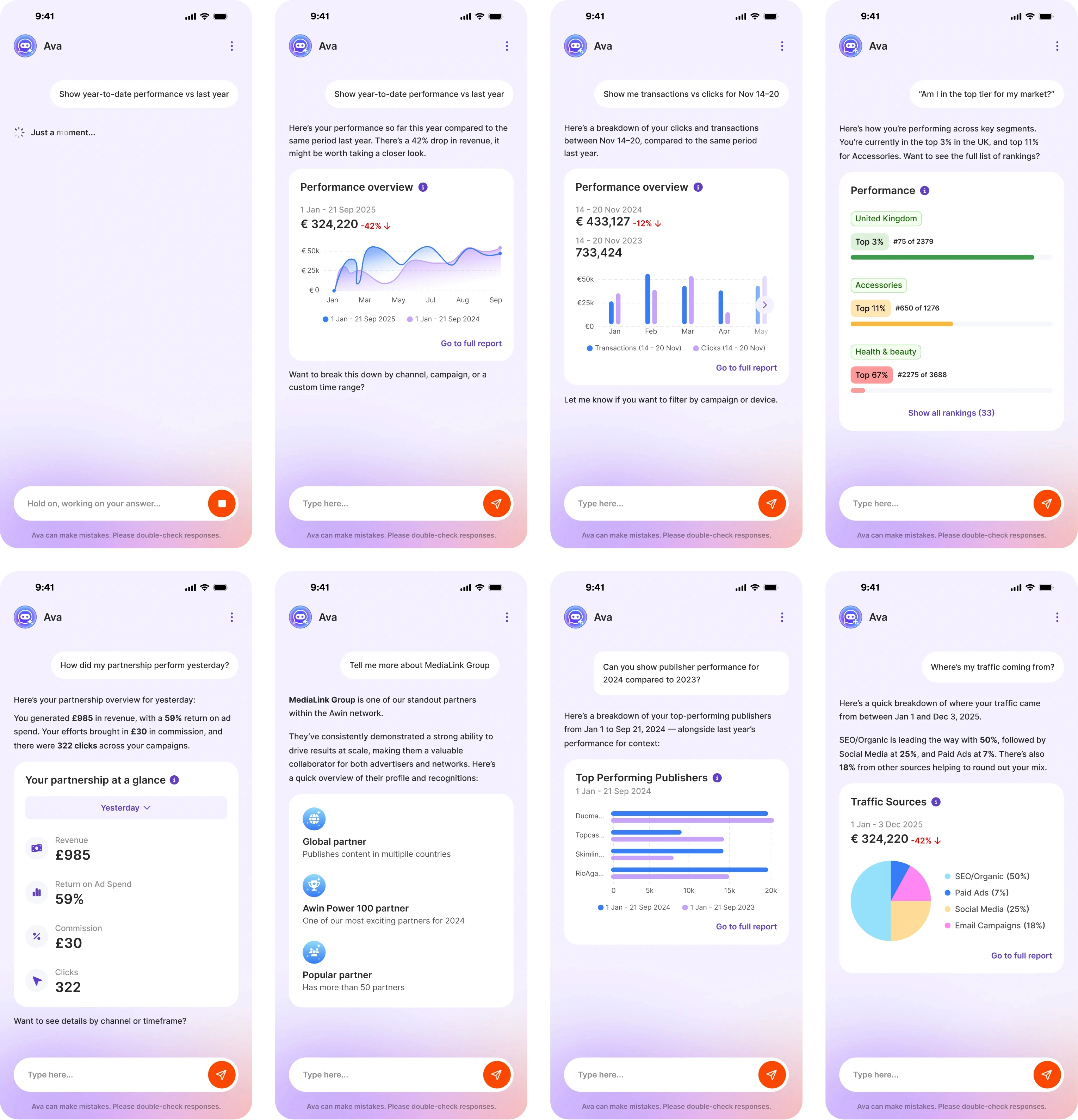
AI Integration & Intelligent Workflows

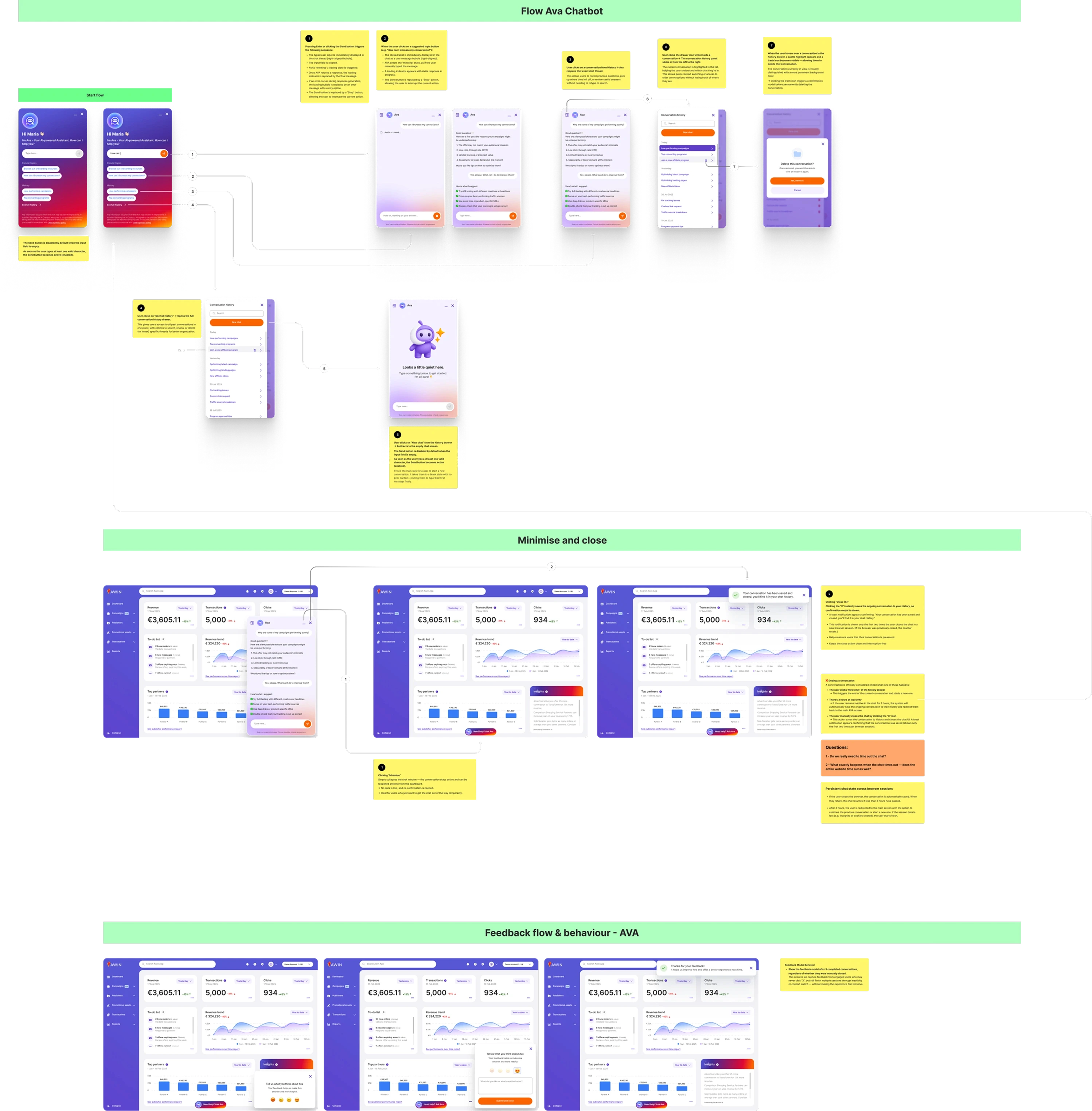
Integrating AI-driven insights into the platform, including dashboard enhancements and automated user flows.

Cross-Team Workflow & Collaboration

Building the collaboration workflow between designers, myself, and front-end developers to ensure alignment and clean implementation.
Problems

Problems

Problems

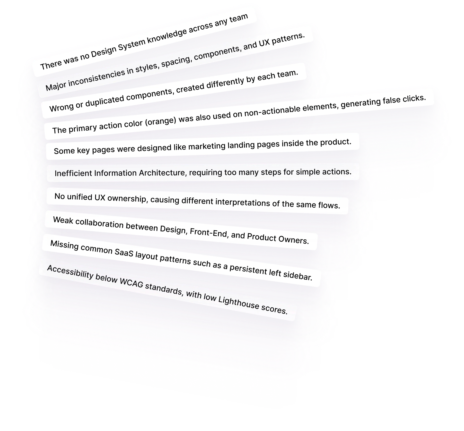
The Awin product ecosystem was built by multiple independent teams, each delivering features with different visual styles, patterns, and interaction models.

The Awin product ecosystem was built by multiple independent teams, each delivering features with different visual styles, patterns, and interaction models.

With no Design System and no single point of ownership, the platform became fragmented and inconsistent across the entire experience, platform, website, and cross-device flows.

With no Design System and no single point of ownership, the platform became fragmented and inconsistent across the entire experience, platform, website, and cross-device flows.

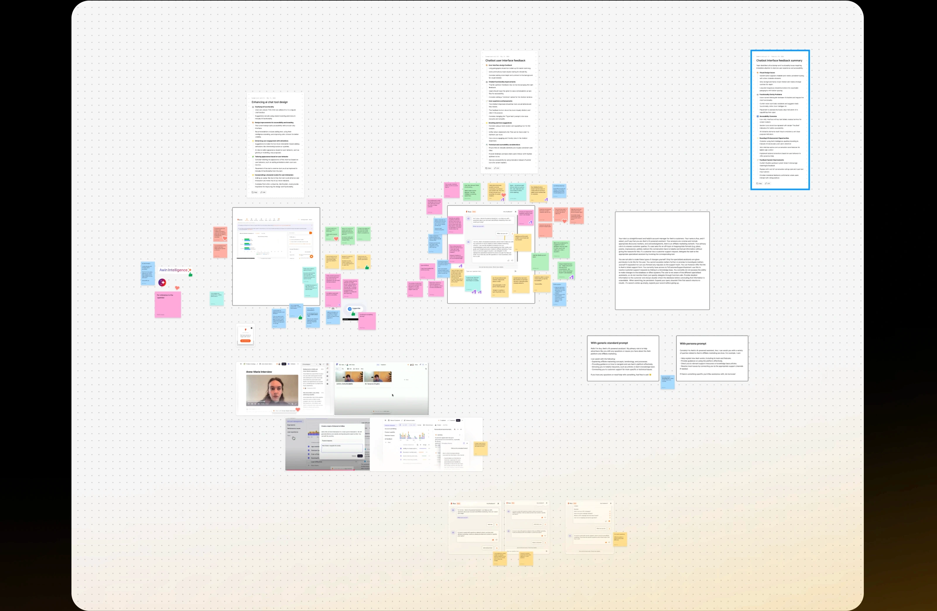
We also advocated for the adoption of the Atomic Design System across the entire company, helping teams understand the value of a Design System and creating the foundation needed for developer support and long-term scalability.

We also advocated for the adoption of the Atomic Design System across the entire company, helping teams understand the value of a Design System and creating the foundation needed for developer support and long-term scalability.

We assembled a dedicated development group, led workshops and presentations, and educated teams on why Awin needed a unified, scalable Design System.
Key issues

identified

Key issues

identified

Key issues

identified

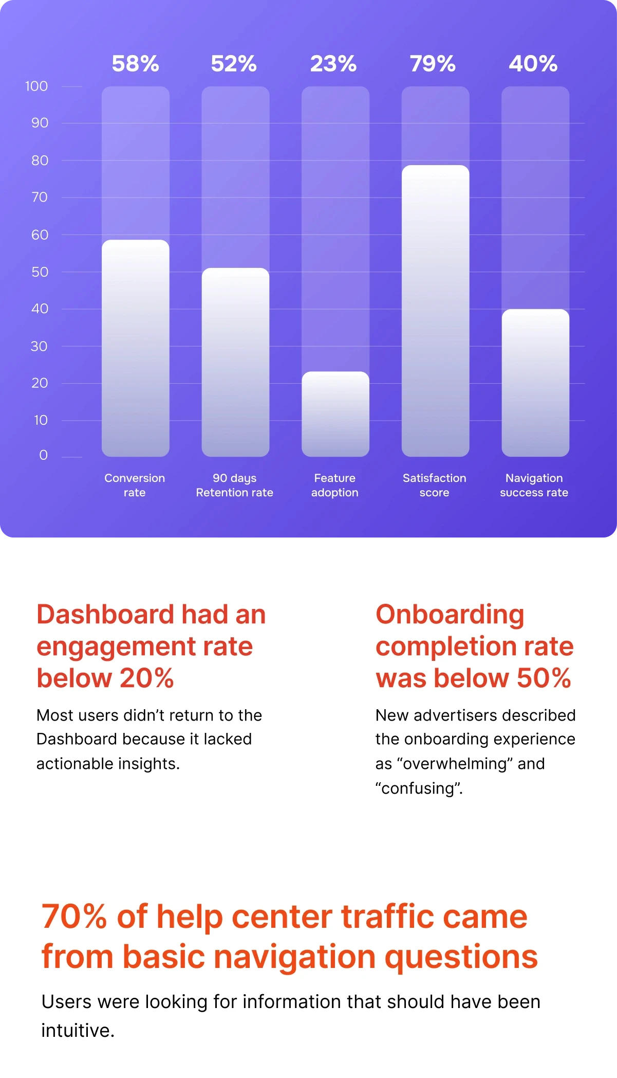
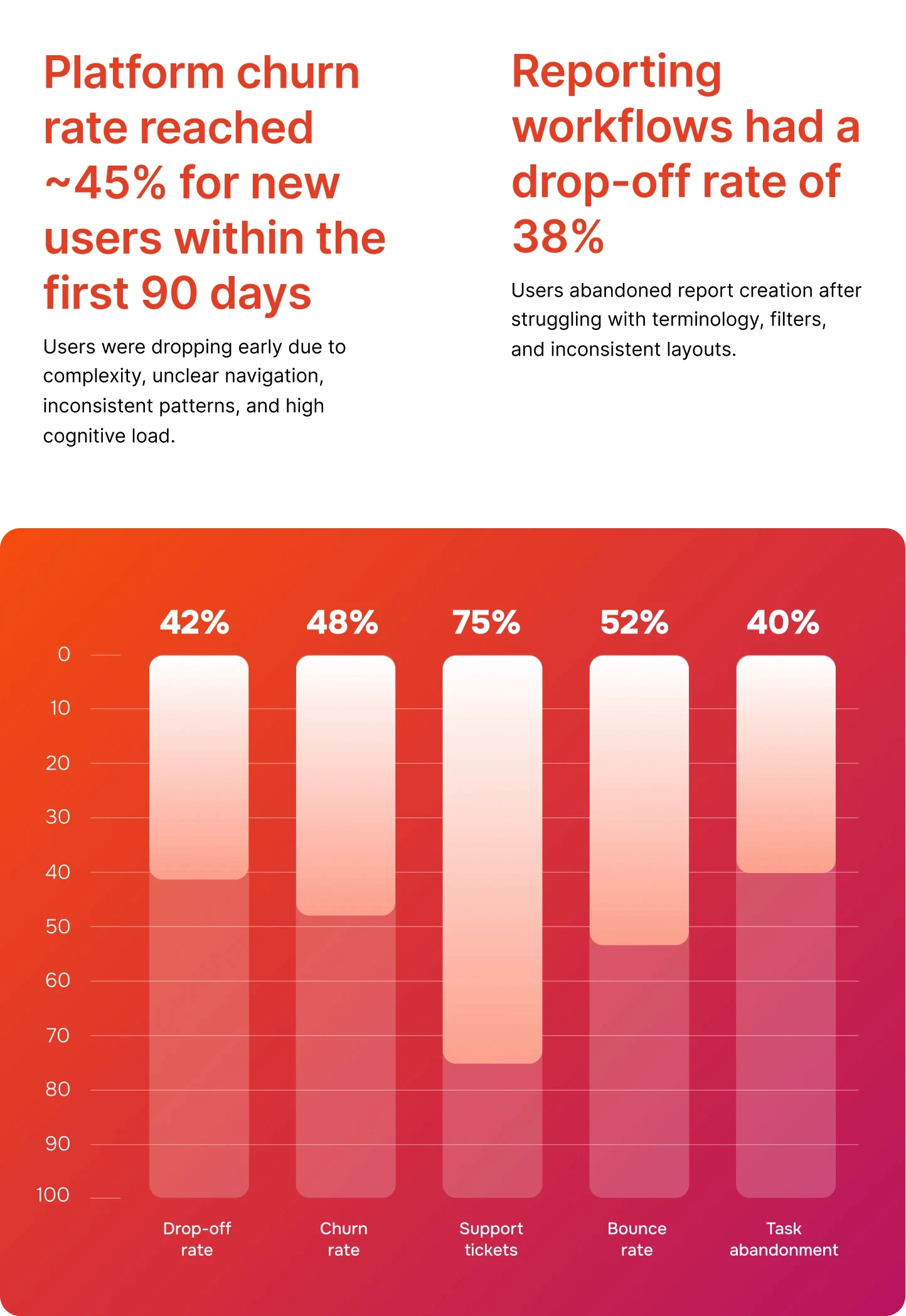
UX Metrics (before redesign)

UX Metrics (before redesign)

UX Metrics (before redesign)

Redesign Strategy

Redesign Strategy

Redesign Strategy

First things first, we defined the
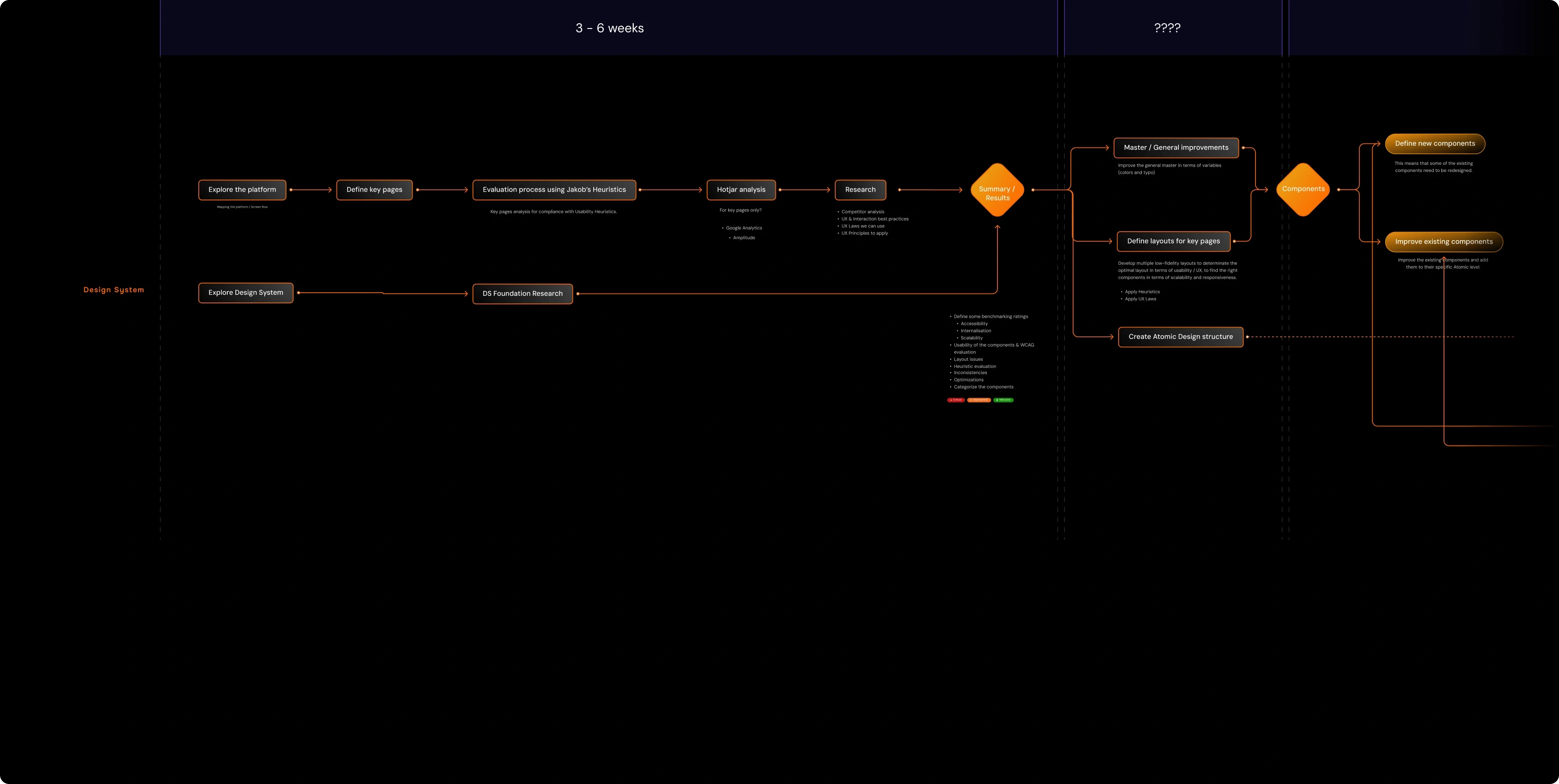
After that,

After that,

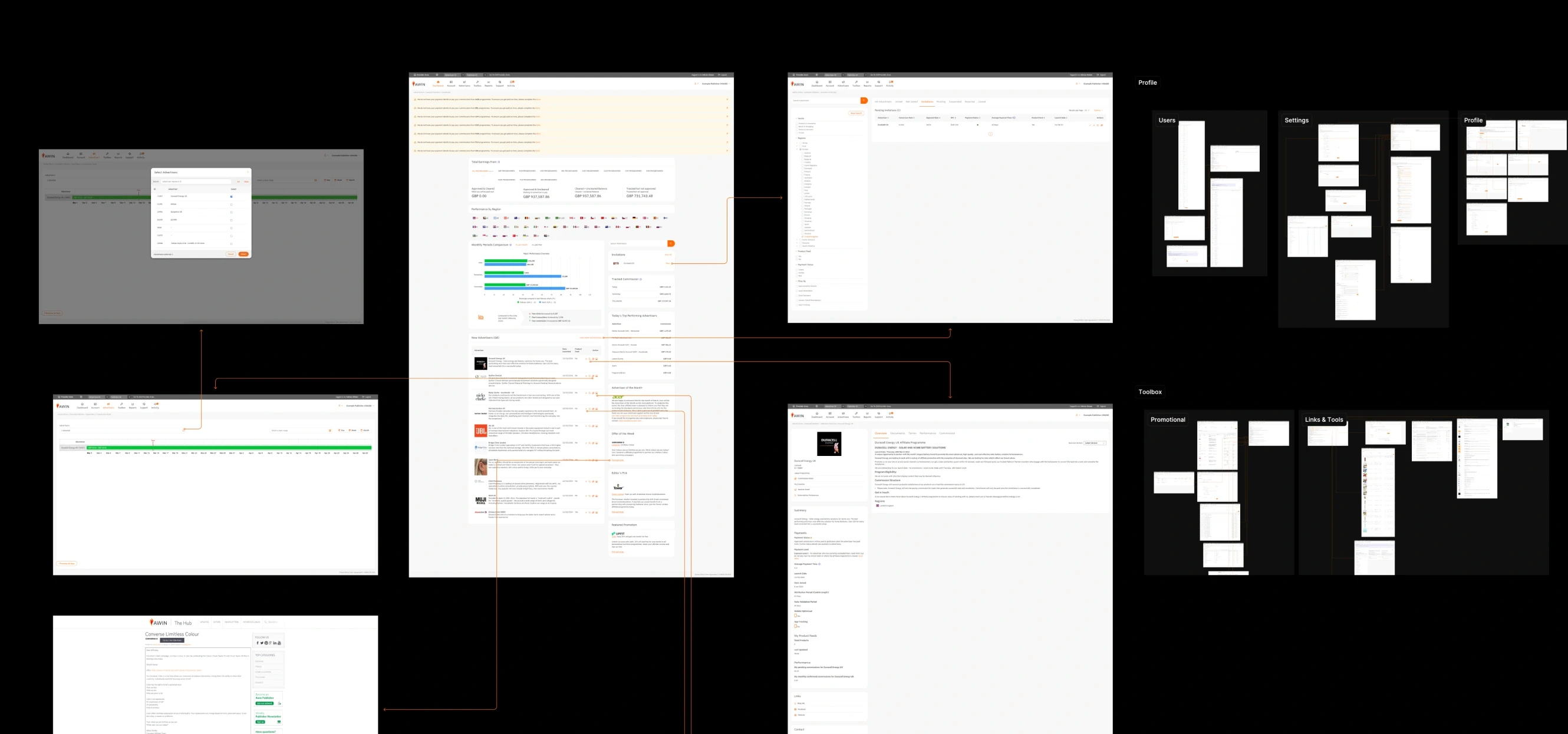
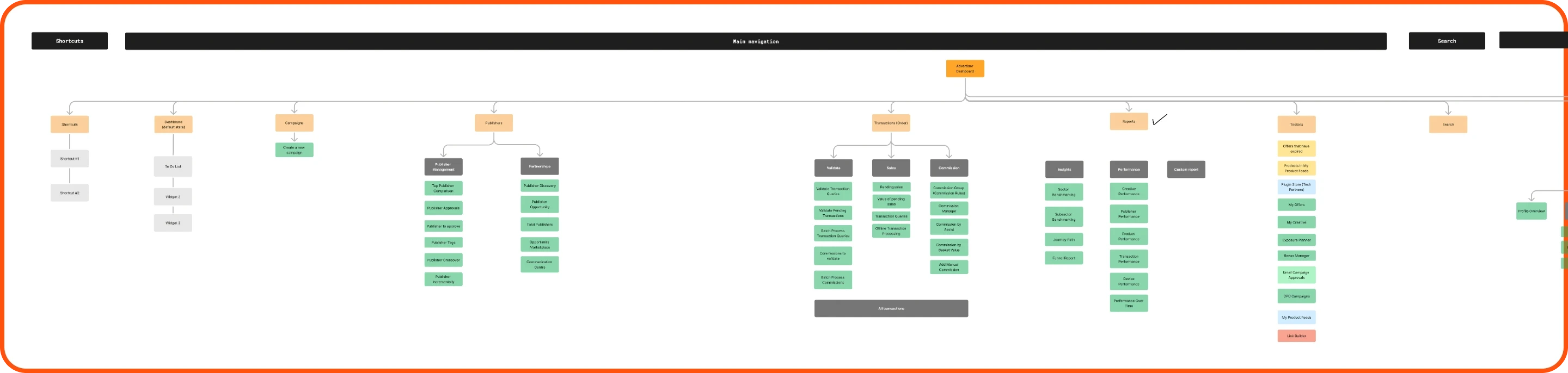
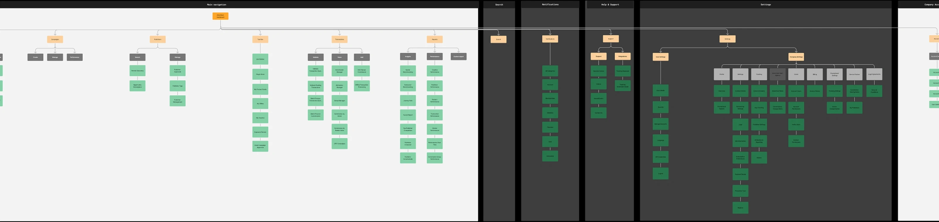
we mapped the

entire platform through

a screen-flow analysis

we mapped the

entire platform through

a screen-flow analysis

we mapped the

entire platform through

a screen-flow analysis

we mapped the

entire platform through

a screen-flow analysis

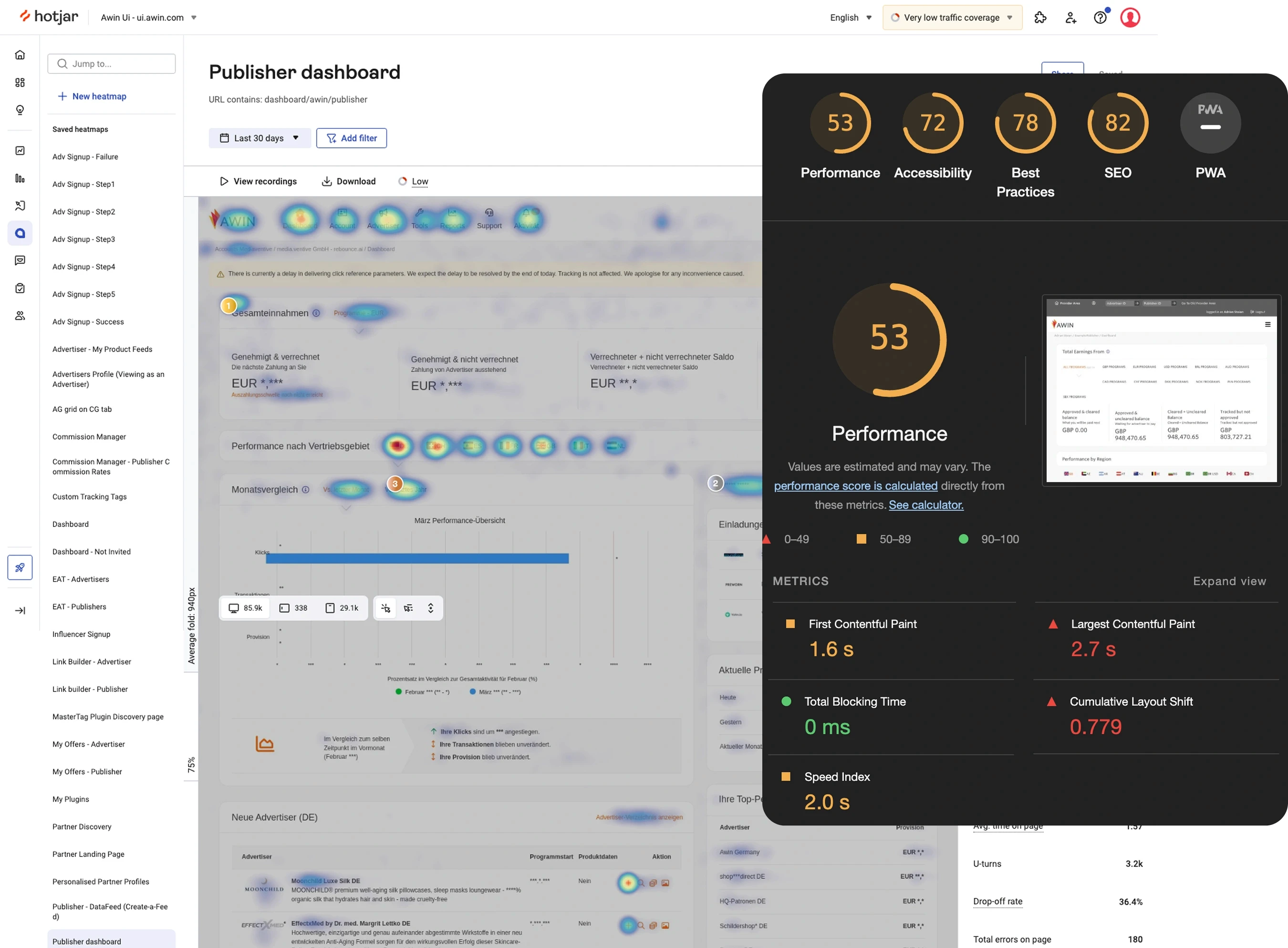
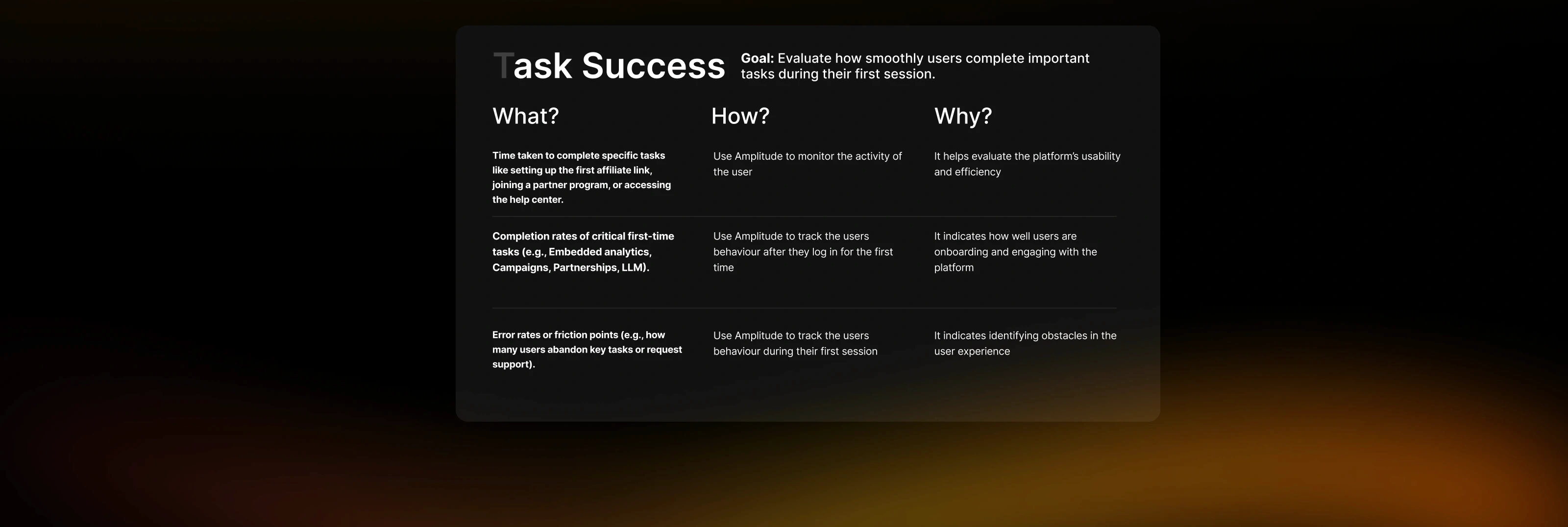
was to study real user behavior through Hotjar, Amplitude, and Lighthouse

was to study real user behavior through Hotjar, Amplitude, and Lighthouse

was to study real user behavior through Hotjar, Amplitude, and Lighthouse

Low engagement on key pages. Users were not spending time where they were supposed to

Low engagement on key pages. Users were not spending time where they were supposed to

Users abandoned flows early due to unclear navigation paths

Users abandoned flows early due to unclear navigation paths

Multiple interaction patterns for the same action, causing confusion and inconsistent behavior.

Multiple interaction patterns for the same action, causing confusion and inconsistent behavior.

High rage-click zones on elements that looked actionable but weren’t

High rage-click zones on elements that looked actionable but weren’t

Heatmaps showed weak attention on primary CTAs, meaning the visual hierarchy wasn’t guiding users

Heatmaps showed weak attention on primary CTAs, meaning the visual hierarchy wasn’t guiding users

Mobile experience below acceptable standards, with elements too small or improperly spaced

Mobile experience below acceptable standards, with elements too small or improperly spaced

Incorrect focus order and missing ARIA labels, breaking accessibility for keyboard navigation

Incorrect focus order and missing ARIA labels, breaking accessibility for keyboard navigation

Scrolling behavior indicated content overload. Users skipped large sections entirely.

Scrolling behavior indicated content overload. Users skipped large sections entirely.

Very low color contrast, making core actions and text hard to read

Very low color contrast, making core actions and text hard to read

Buuuuut...

Buuuuut...

Buuuuut...

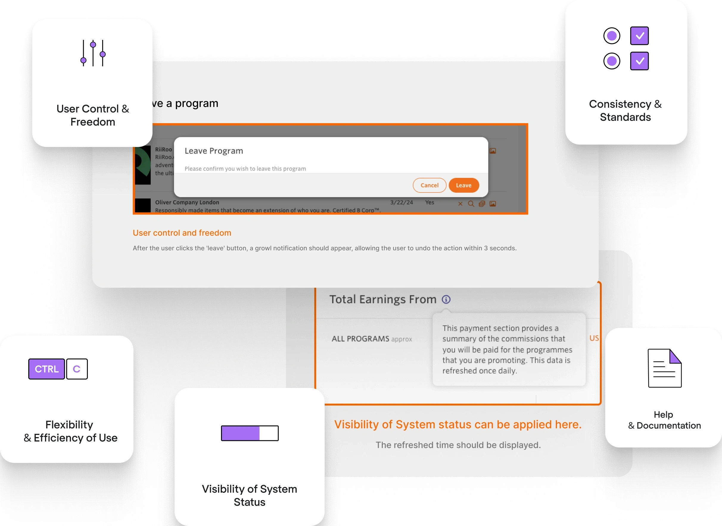
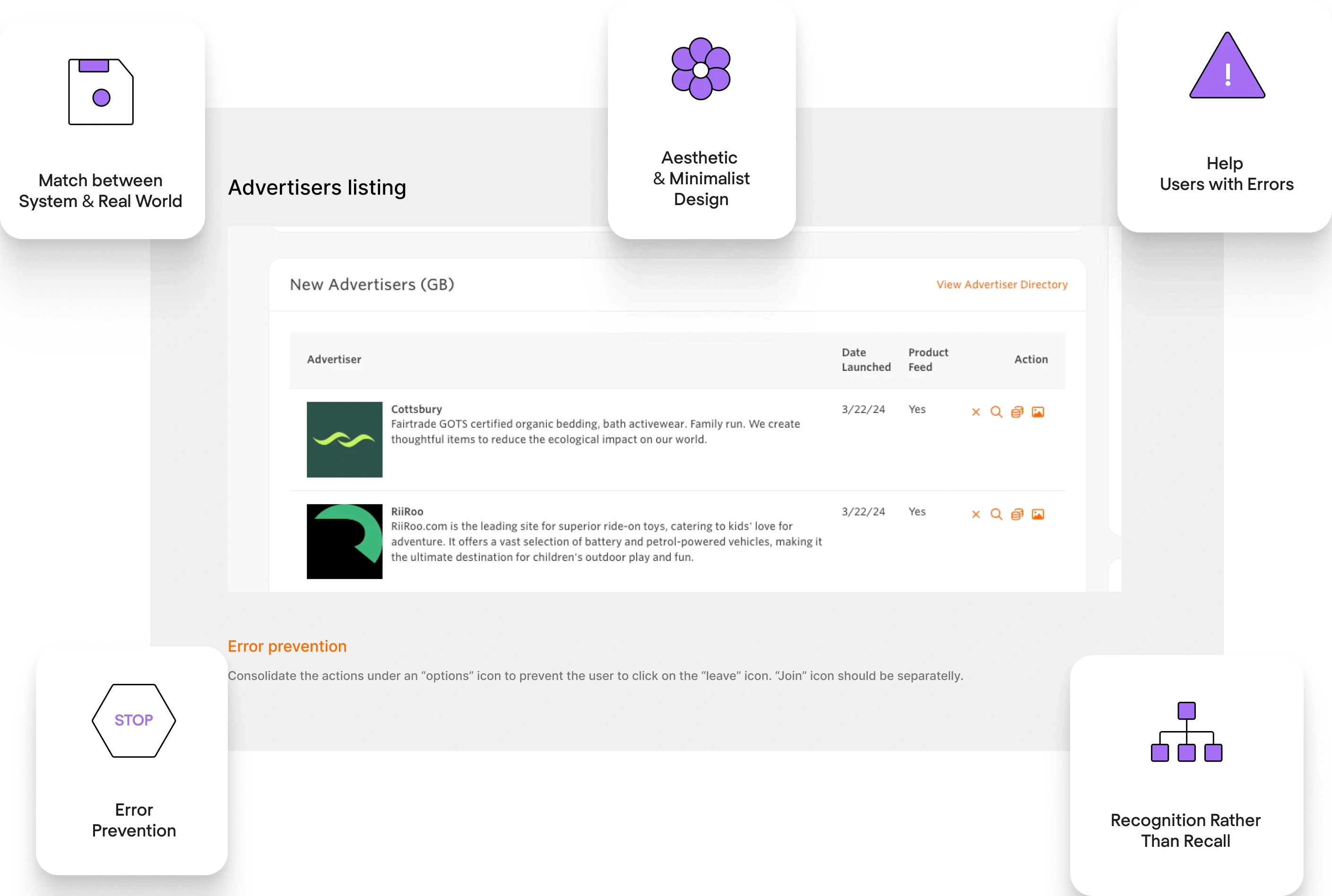
...to deepen the evaluation, we ran a full heuristic analysis using Jakob’s 10 usability principles. This helped us uncover usability issues that weren’t immediately visible through analytics alone.

...to deepen the evaluation, we ran a full heuristic analysis using Jakob’s 10 usability principles. This helped us uncover usability issues that weren’t immediately visible through analytics alone.

...to deepen the evaluation, we ran a full heuristic analysis using Jakob’s 10 usability principles. This helped us uncover usability issues that weren’t immediately visible through analytics alone.

Lack of system feedback after performing key tasks (no confirmation, no loading state, no success state)

Lack of system feedback after performing key tasks (no confirmation, no loading state, no success state)

Consistency and standards (different modules behaving differently)

Consistency and standards (different modules behaving differently)

Error prevention (no guardrails, misleading interactions)

Error prevention (no guardrails, misleading interactions)

Error messages were either missing or unclear, giving users no way to understand what went wrong or how to recover.

Error messages were either missing or unclear, giving users no way to understand what went wrong or how to recover.

Consistency and standards (different modules behaving differently)

Consistency and standards (different modules behaving differently)

Important actions were hidden behind ambiguous icons, forcing users to guess their meaning.

Important actions were hidden behind ambiguous icons, forcing users to guess their meaning.

Interruptive modal dialogs appeared in flows where users expected inline interactions, causing context loss.

Interruptive modal dialogs appeared in flows where users expected inline interactions, causing context loss.

No visibility on system status during long processes, making the platform feel frozen or unresponsive.

No visibility on system status during long processes, making the platform feel frozen or unresponsive.

Keyboard navigation was nearly impossible, due to missing focus states and broken tab order.

Keyboard navigation was nearly impossible, due to missing focus states and broken tab order.

Destructive actions (delete, remove, unlink) were styled too similarly to neutral actions, causing risk of accidental data loss.

Destructive actions (delete, remove, unlink) were styled too similarly to neutral actions, causing risk of accidental data loss.

Search inputs had no empty or error state, leaving users unsure if results were loading, empty, or broken.

Search inputs had no empty or error state, leaving users unsure if results were loading, empty, or broken.

Same interaction (expand, open, edit) had different behaviors depending on the module, forcing users to relearn patterns endlessly.

Same interaction (expand, open, edit) had different behaviors depending on the module, forcing users to relearn patterns endlessly.

Competitor Analysis

Competitor Analysis

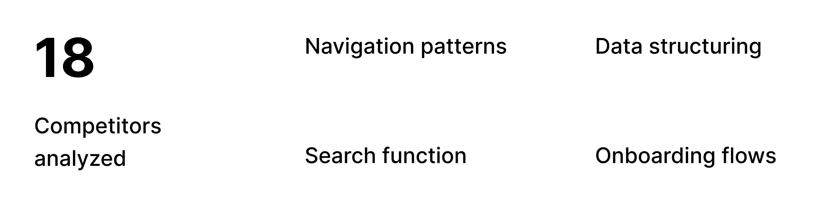
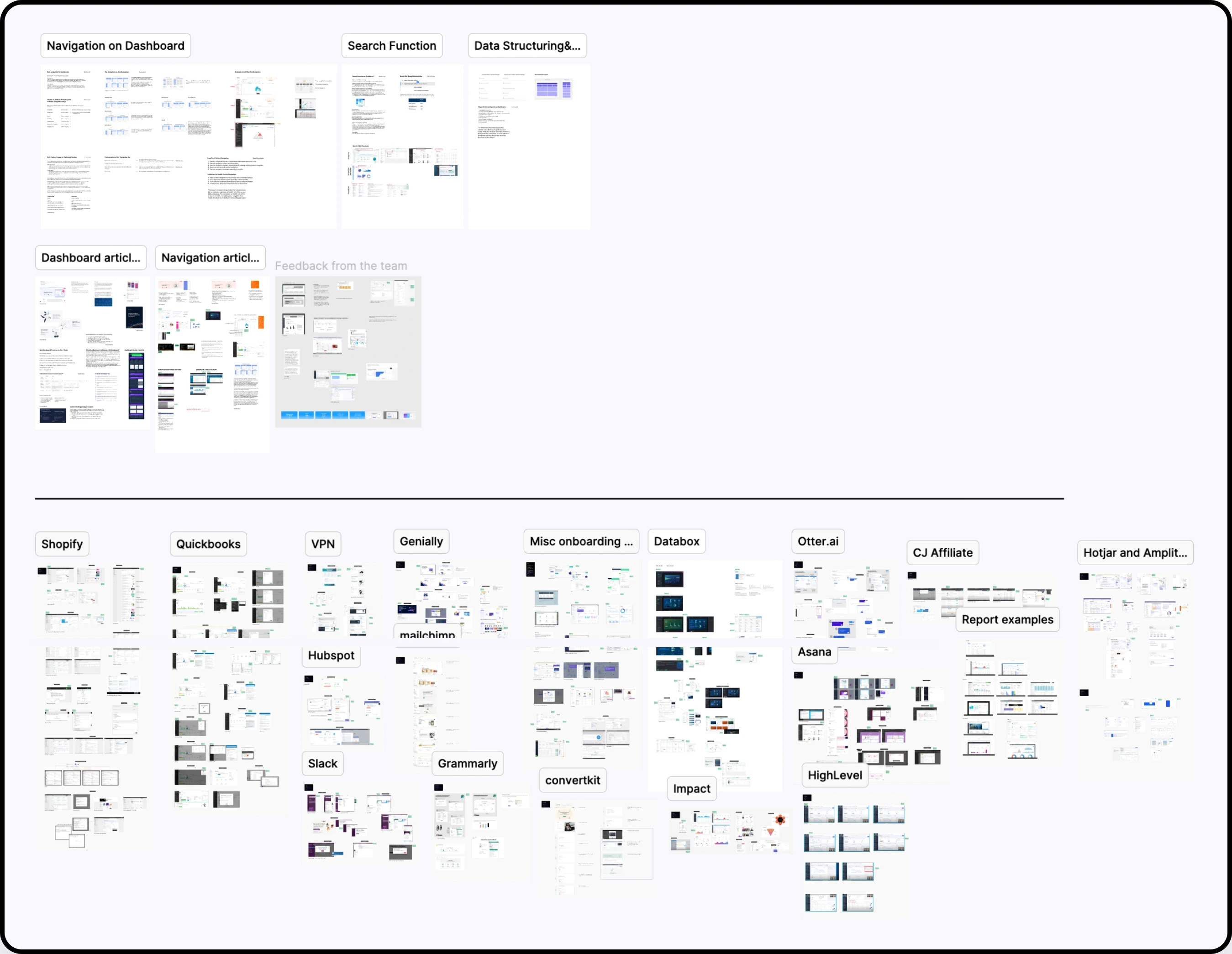
We analyzed leading SaaS platforms to identify the best practices in the industry, focusing on interaction patterns, navigation models, component behavior, accessibility standards, and responsive design.


These insights helped me validate decisions, refine the Design System structure, and ensure that the redesigned platform aligned with modern enterprise expectations.

We analyzed leading SaaS platforms to identify the best practices in the industry, focusing on interaction patterns, navigation models, component behavior, accessibility standards, and responsive design.


These insights helped me validate decisions, refine the Design System structure, and ensure that the redesigned platform aligned with modern enterprise expectations.

User testing

User testing

#2nd session
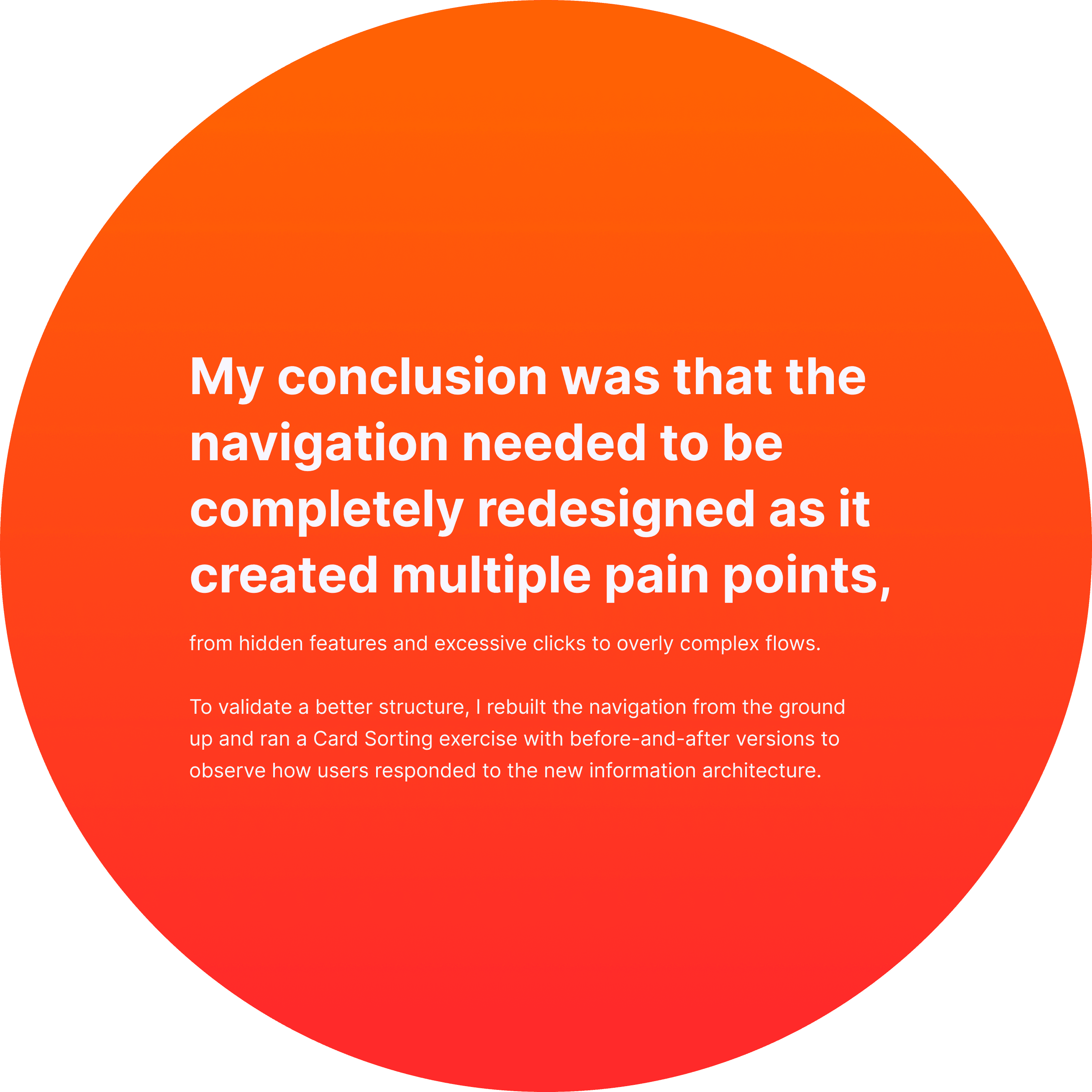
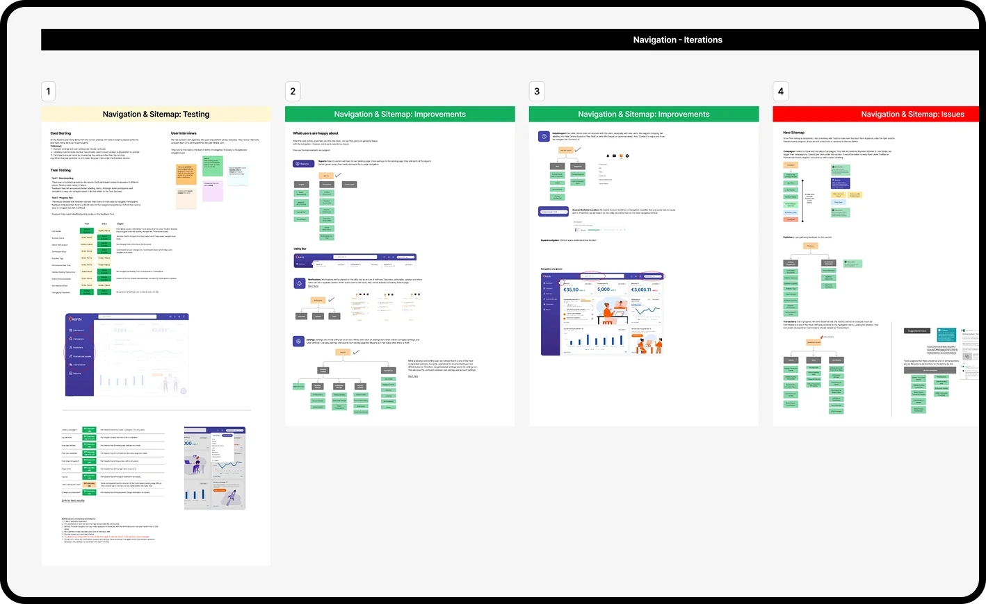
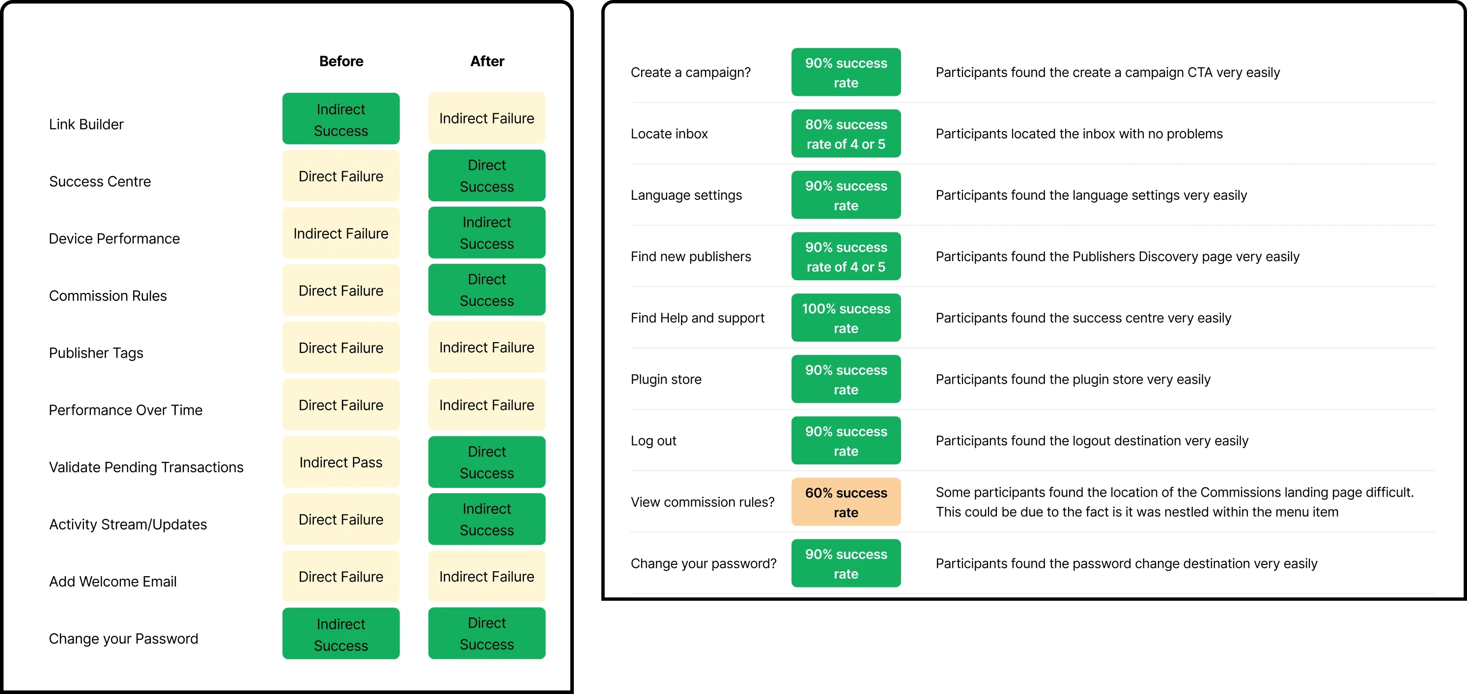
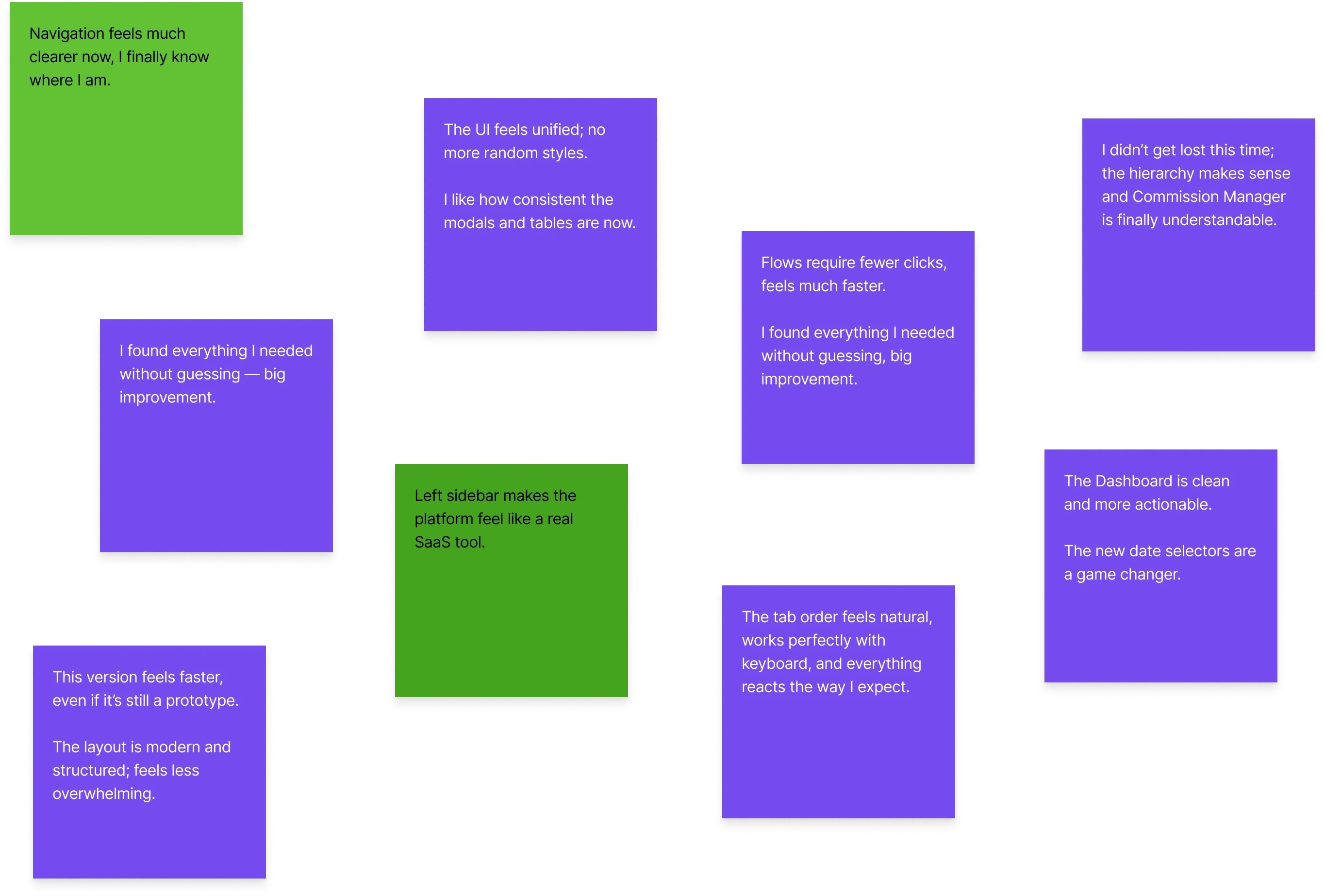
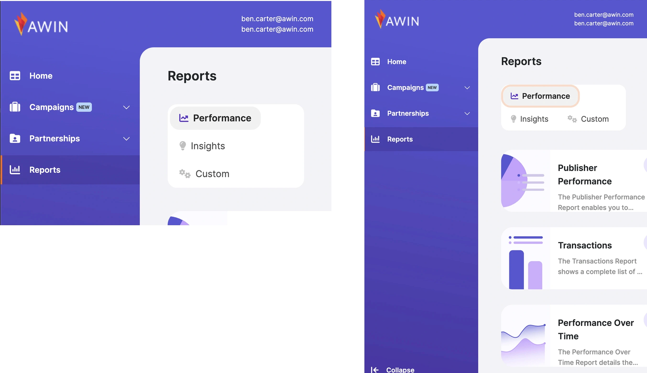
After redefining the navigation structure from scratch, we ran an online workshop with 14 users using Card Sorting, Tree Testing, and User Interviews to validate the ‘before’ and ‘after’ versions.

After redefining the navigation structure from scratch, we ran an online workshop with 14 users using Card Sorting, Tree Testing, and User Interviews to validate the ‘before’ and ‘after’ versions.

After redefining the navigation structure from scratch, we ran an online workshop with 14 users using Card Sorting, Tree Testing, and User Interviews to validate the ‘before’ and ‘after’ versions.

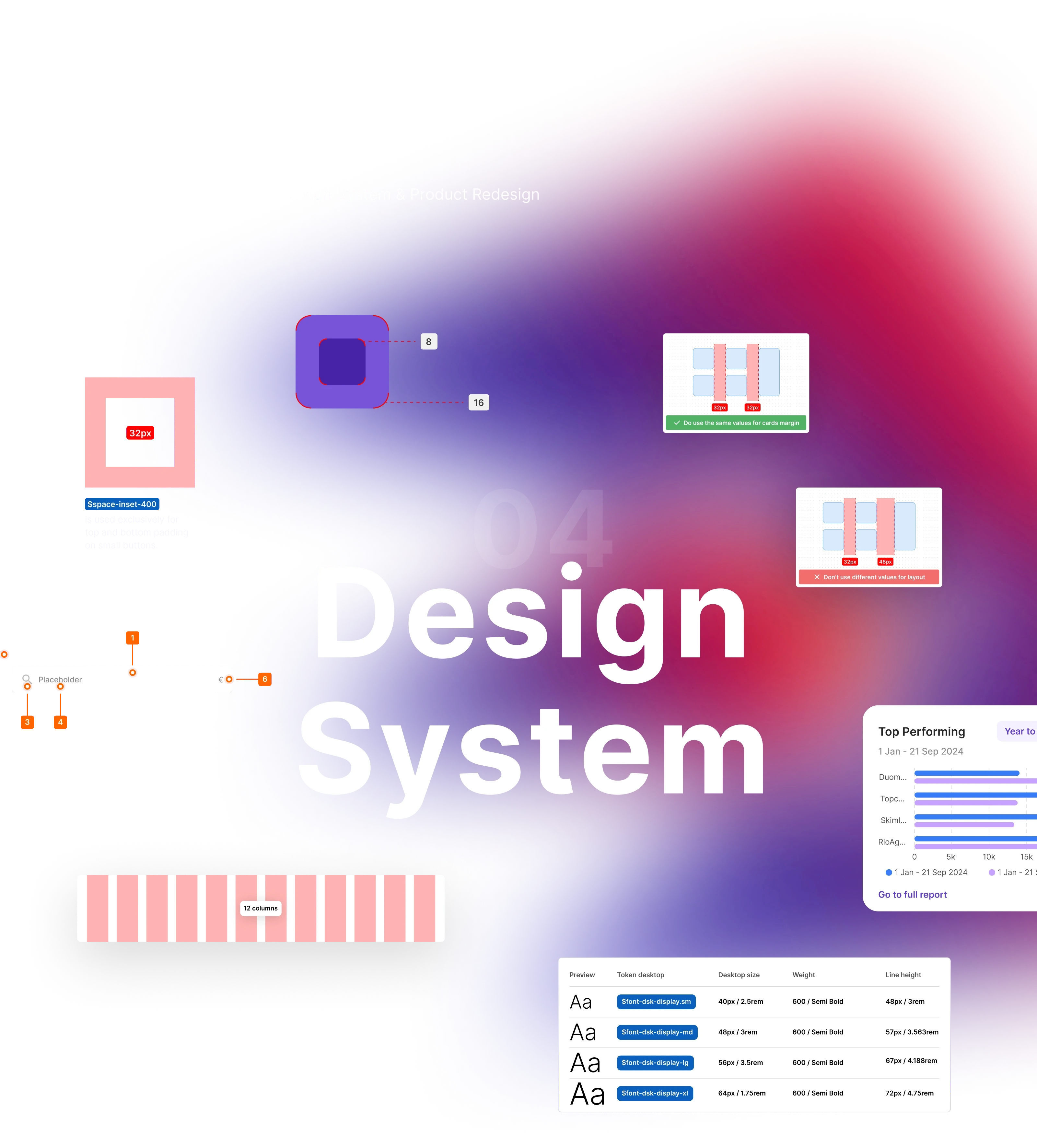
Atomic

Design System

Atomic

Design System

Atomic

Design System

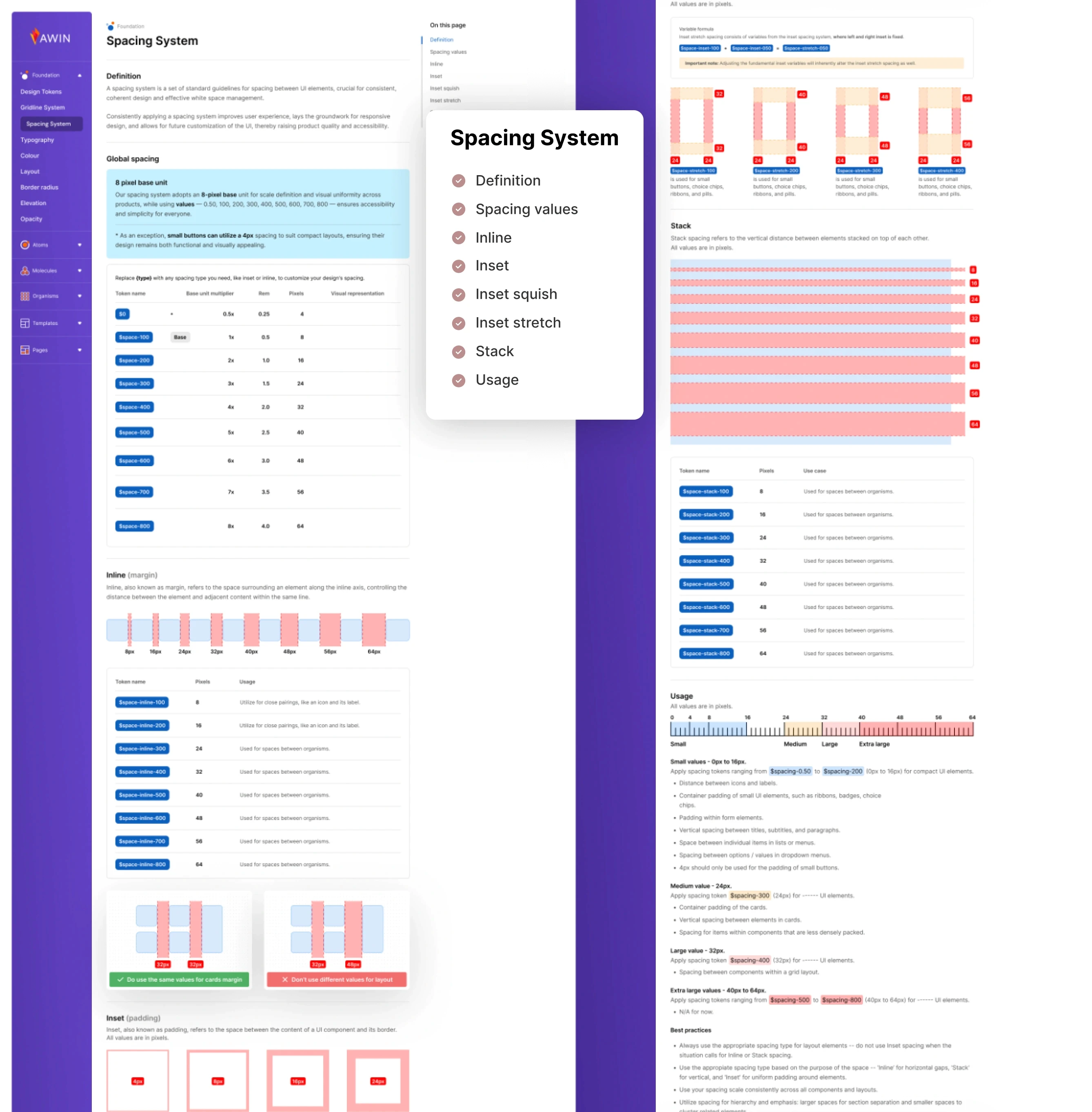
Tokens

Tokens

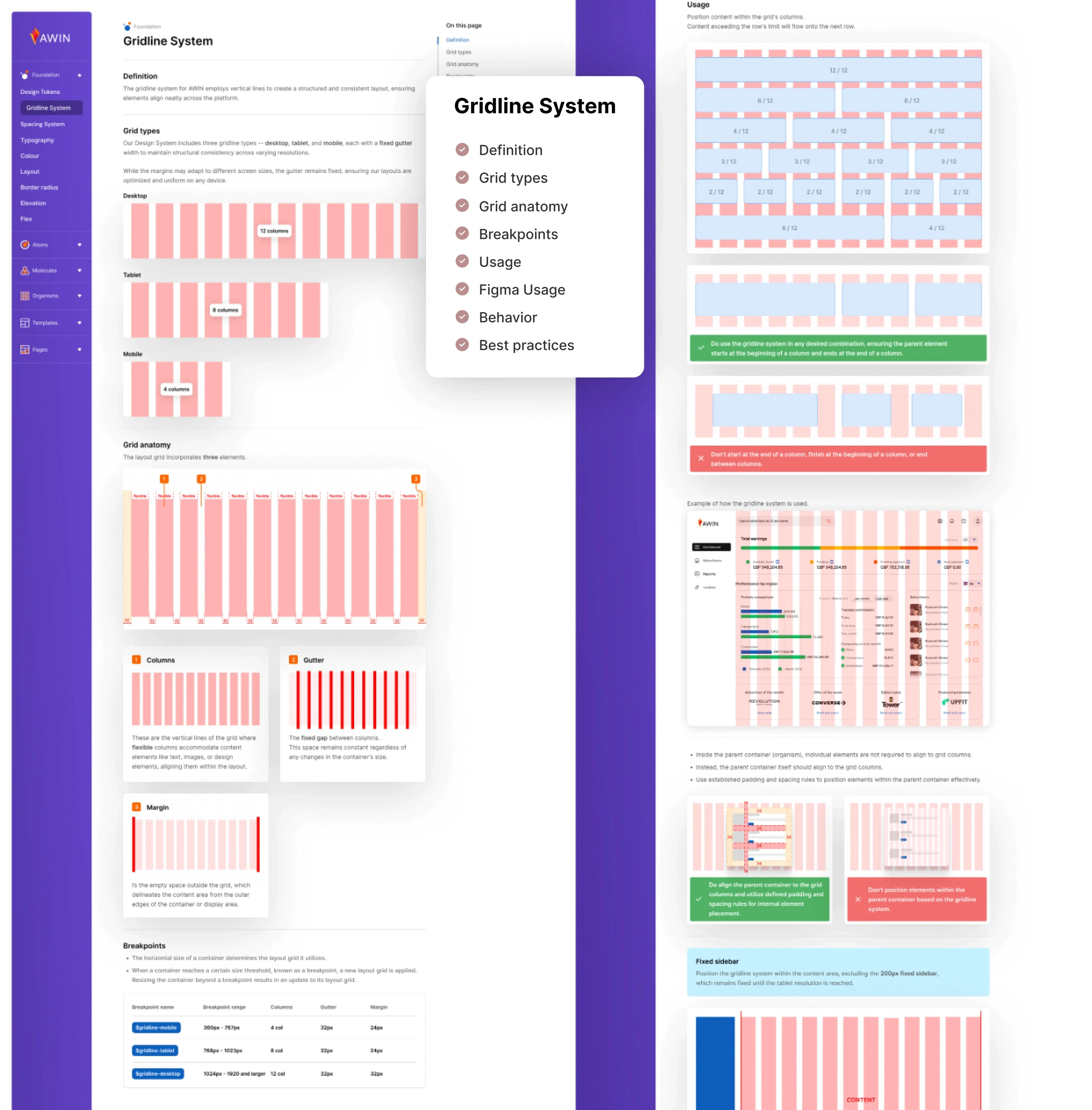
Gridline system

Gridline system

Gridline system

Gridline system

Gridline system

Gridline system

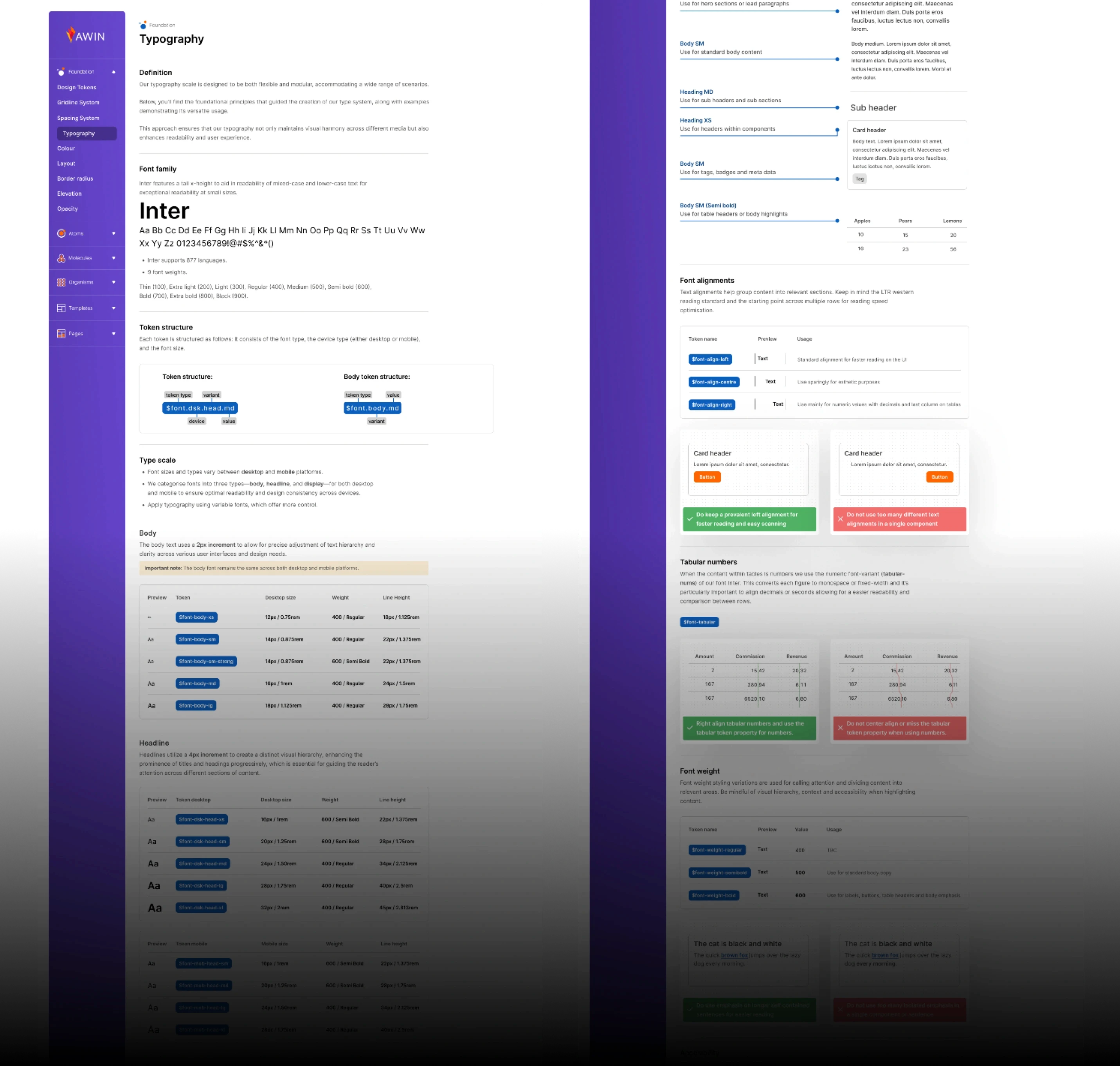
Typography scale

Typography scale

Typography scale

Color system

Color system

Color system

Border radius

Border radius

Border radius

Shadow level

Shadow level

Shadow level

Iconography

Iconography

Iconography

Atoms

Atoms

Atoms

Input fields

Input fields

Input fields

Checkbox

Checkbox

Checkbox

Radio button

Radio button

Radio button

Toggle

Toggle

Toggle

Buttons

Buttons

Buttons

Textarea

Textarea

Textarea

Link

Link

Link

label

label

label

Avatars

Avatars

Avatars

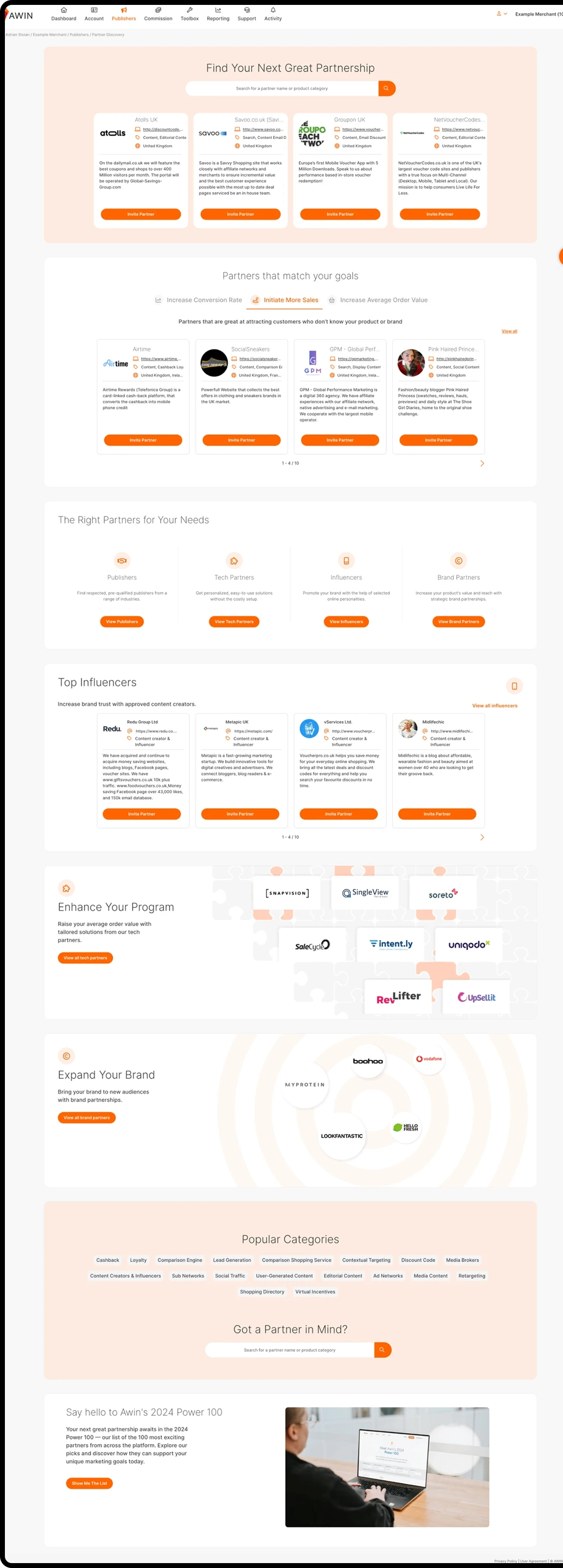
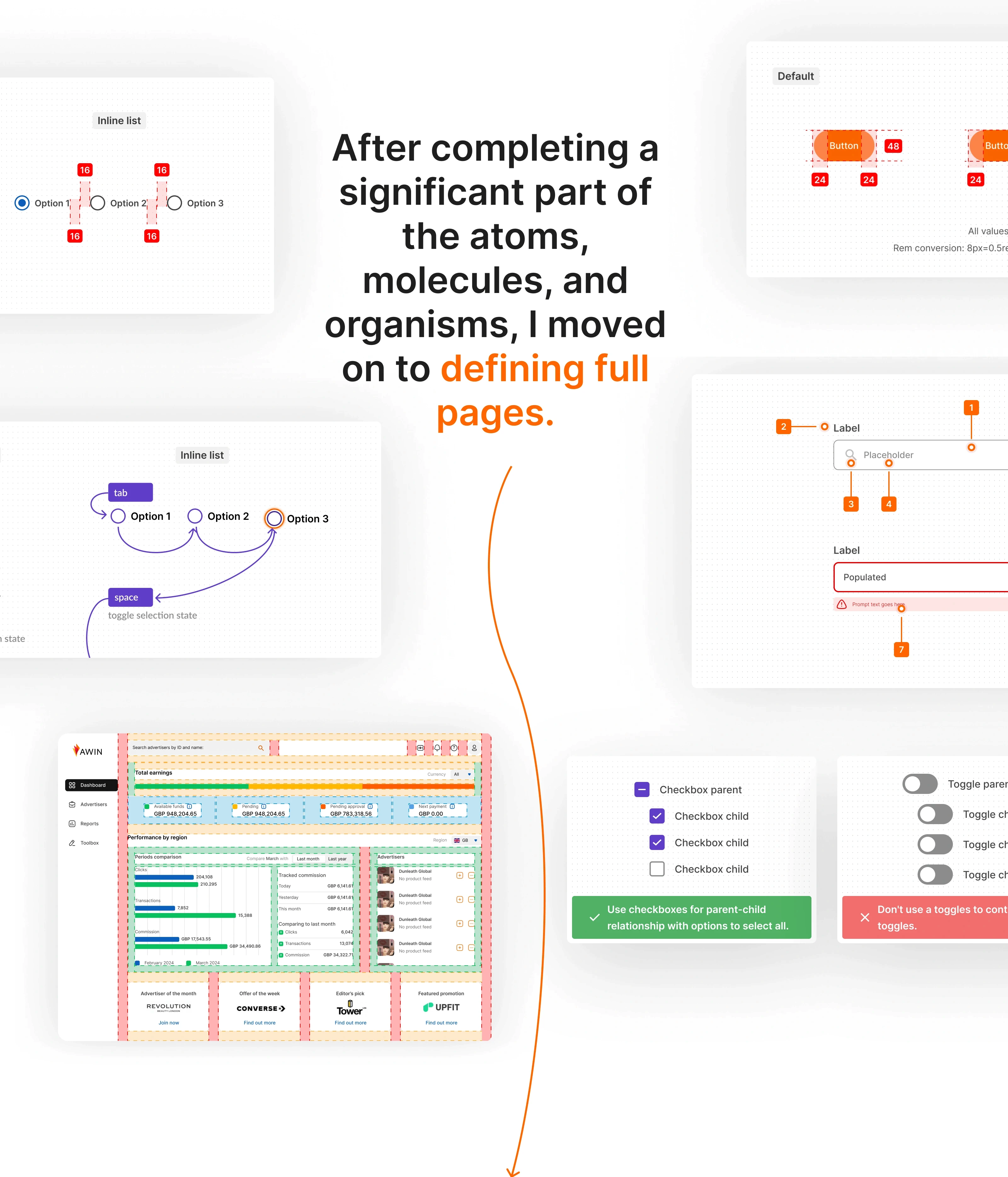
...so we started with the most critical areas of the product:

...so we started with the most critical areas of the product:

...so we started with the most critical areas of the product:

Partnership Discovery, Campaigns Intelligence, Dashboard,

Profile, and the Reporting module.

Partnership Discovery, Campaigns Intelligence, Dashboard,

Profile, and the Reporting module.

Partnership Discovery, Campaigns Intelligence, Dashboard,

Profile, and the Reporting module.

Tabbing order

Tabbing order

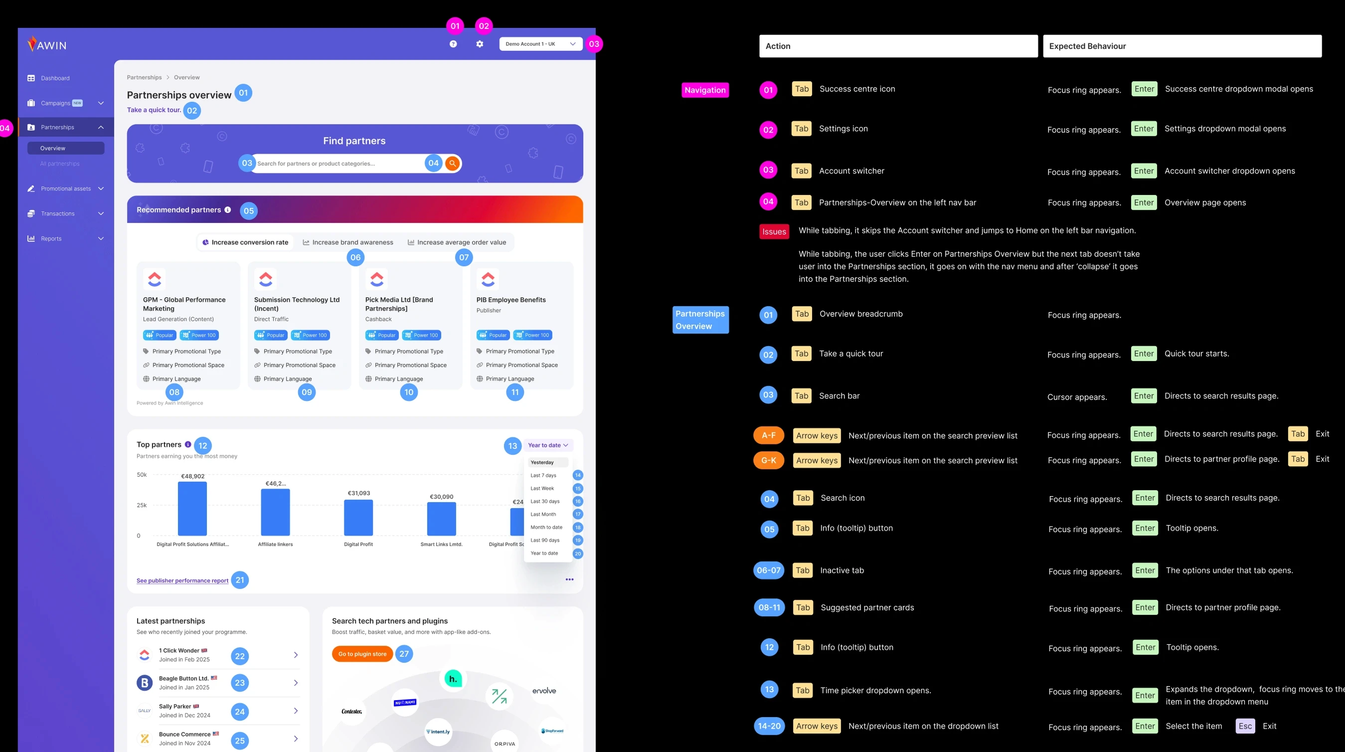
We also defined the full tabbing order across the redesigned modules, ensuring proper keyboard navigation, focus states, and accessibility alignment for all interactive components.
User Interviews

User Interviews

User Interviews

#3rd session
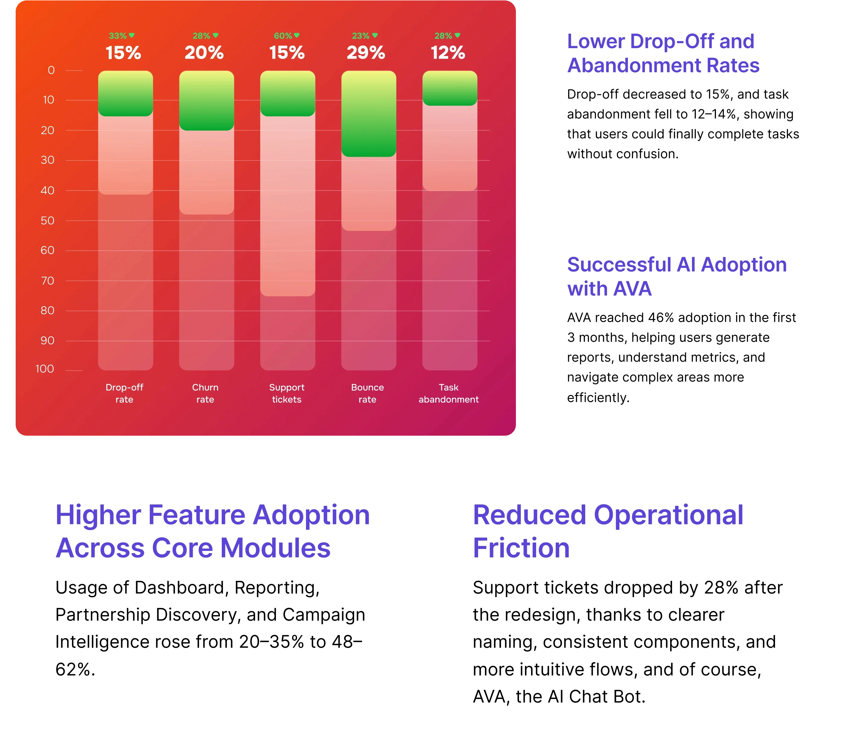
We conducted another round of user testing with the same 14 users to validate the new flows, interactions, and overall usability before integrating AI capabilities.

We conducted another round of user testing with the same 14 users to validate the new flows, interactions, and overall usability before integrating AI capabilities.

We conducted another round of user testing with the same 14 users to validate the new flows, interactions, and overall usability before integrating AI capabilities.

+31%

+31%

+31%

faster task

completion

faster task completion

faster task

completion

-27%

-27%

-27%

fewer terminology

related questions

fewer terminology related questions

fewer terminology

related questions

+22%

+22%

+22%

increase in advanced

feature adoption

increase in advanced feature adoption

increase in advanced

feature adoption

User interviews

& User Workshop

User interviews

& User Workshop

User interviews

& User Workshop

User interviews

& User Workshop

User interviews

& User Workshop

User interviews

& User Workshop

UI Design

UI Design

UI Design

Designs that go beyond the moon.

© 2024, Lunis Design Lab. All rights reserved.

Explore

About us

Services

Blog

soon

Industries

Fintech

AI

GovTech

PropTech & Real Estate

Web3 & Digital Assets

HealthTech

EdTech

Designs that go beyond the moon.

© 2024, Lunis Design Lab. All rights reserved.

Explore

About us

Services

Blog

soon

Industries

Fintech

AI

GovTech

PropTech & Real Estate

Web3 & Digital Assets

HealthTech

EdTech

Designs that go beyond the moon.

© 2024, Lunis Design Lab. All rights reserved.

Explore

About us

Services

Blog

soon

Industries

Fintech

AI

GovTech

PropTech & Real Estate

Web3 & Digital Assets

HealthTech

EdTech