

INDUSTRY
Business Relationship Management (BRM)
Contributions
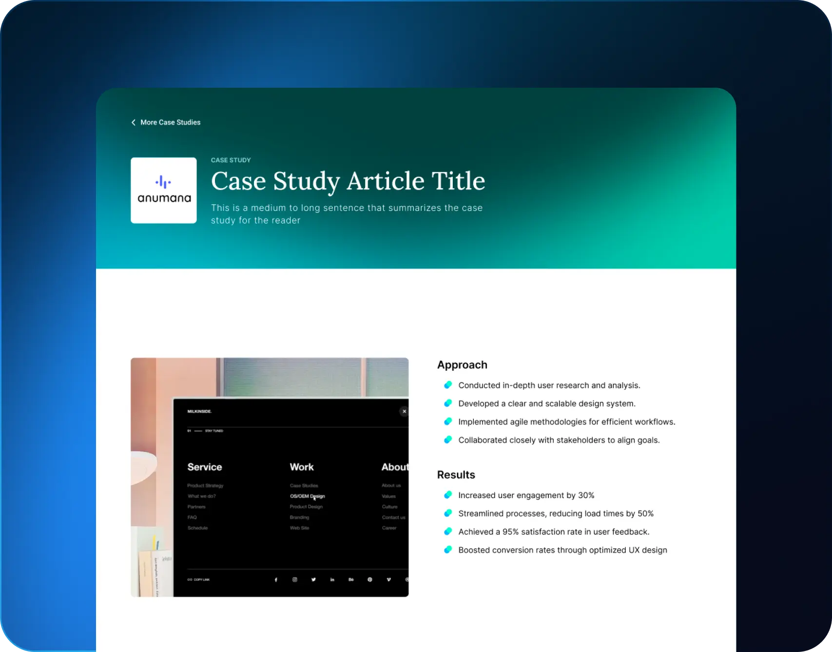
UX/UI Review
Duration
2 weeks
Release
2023
🎯 Goals
Improve Usability
Enhance Visual Consistency
Optimize User Engagement
Streamline Information Architecture
Increase Accessibility
Provide Actionable Insights
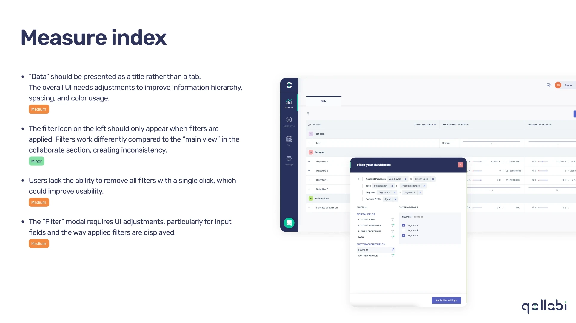
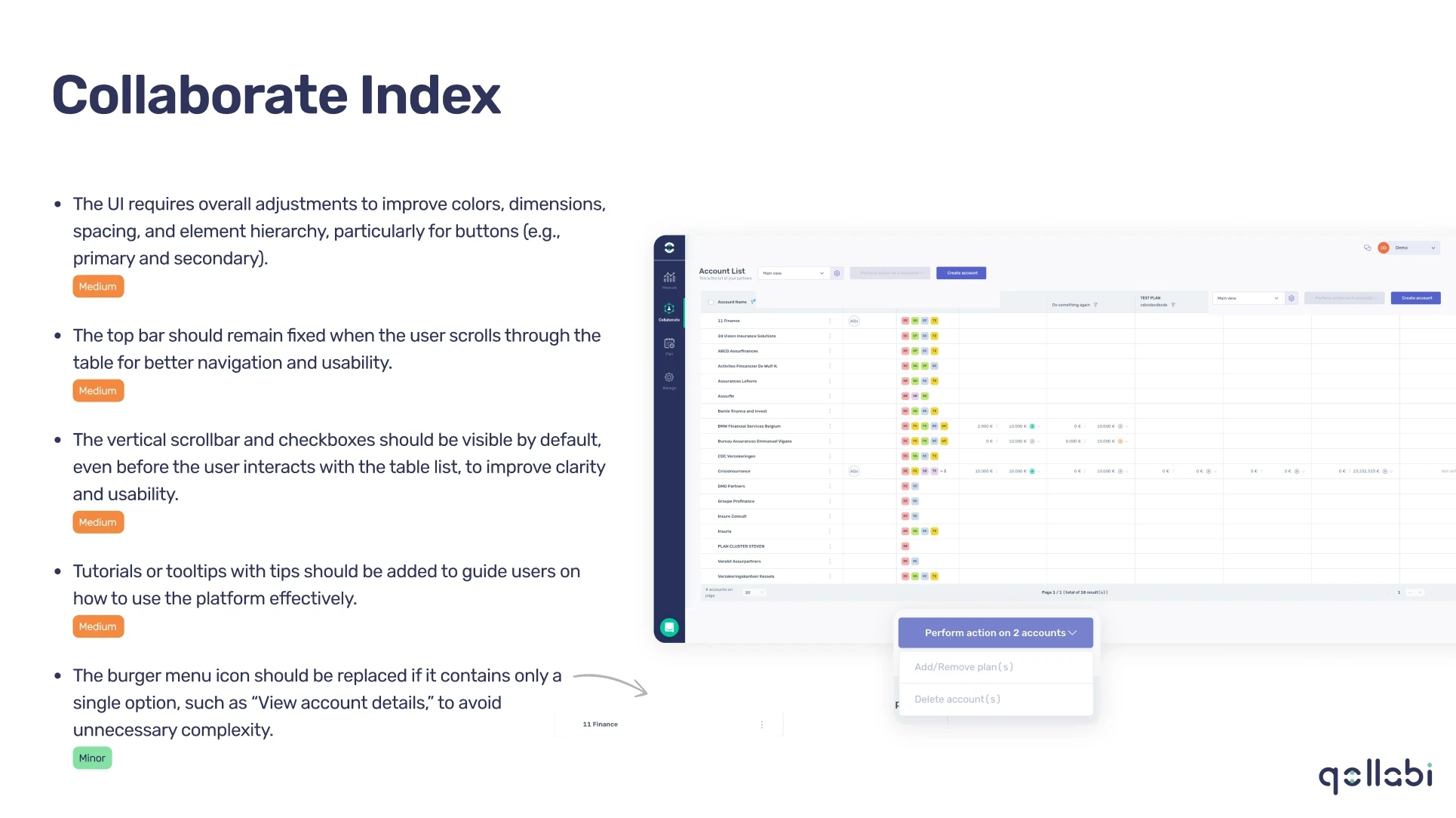
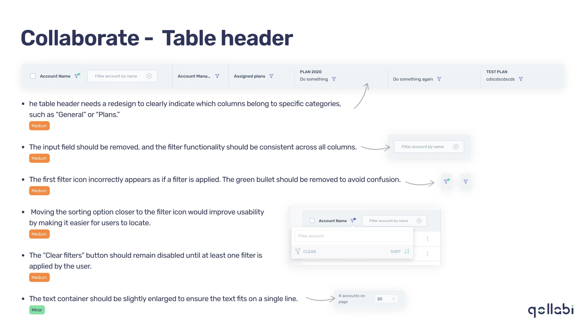
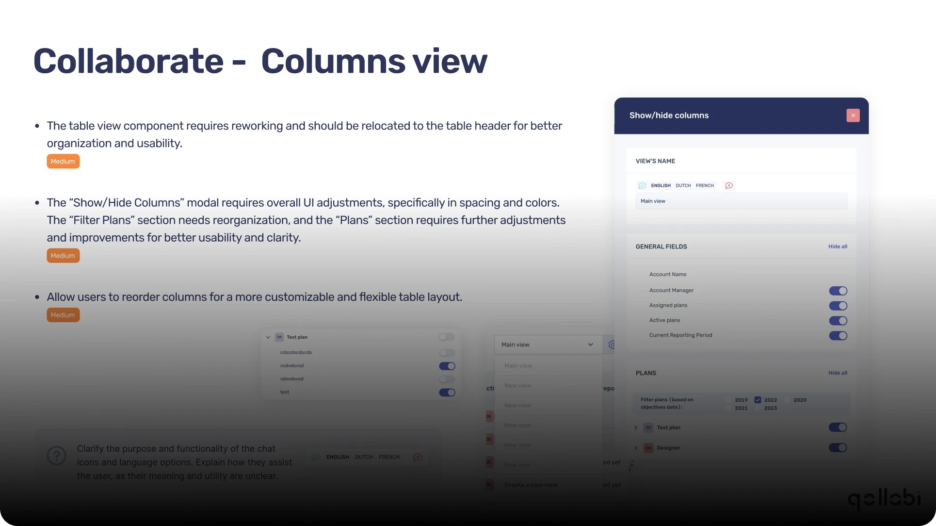
👀 Findings
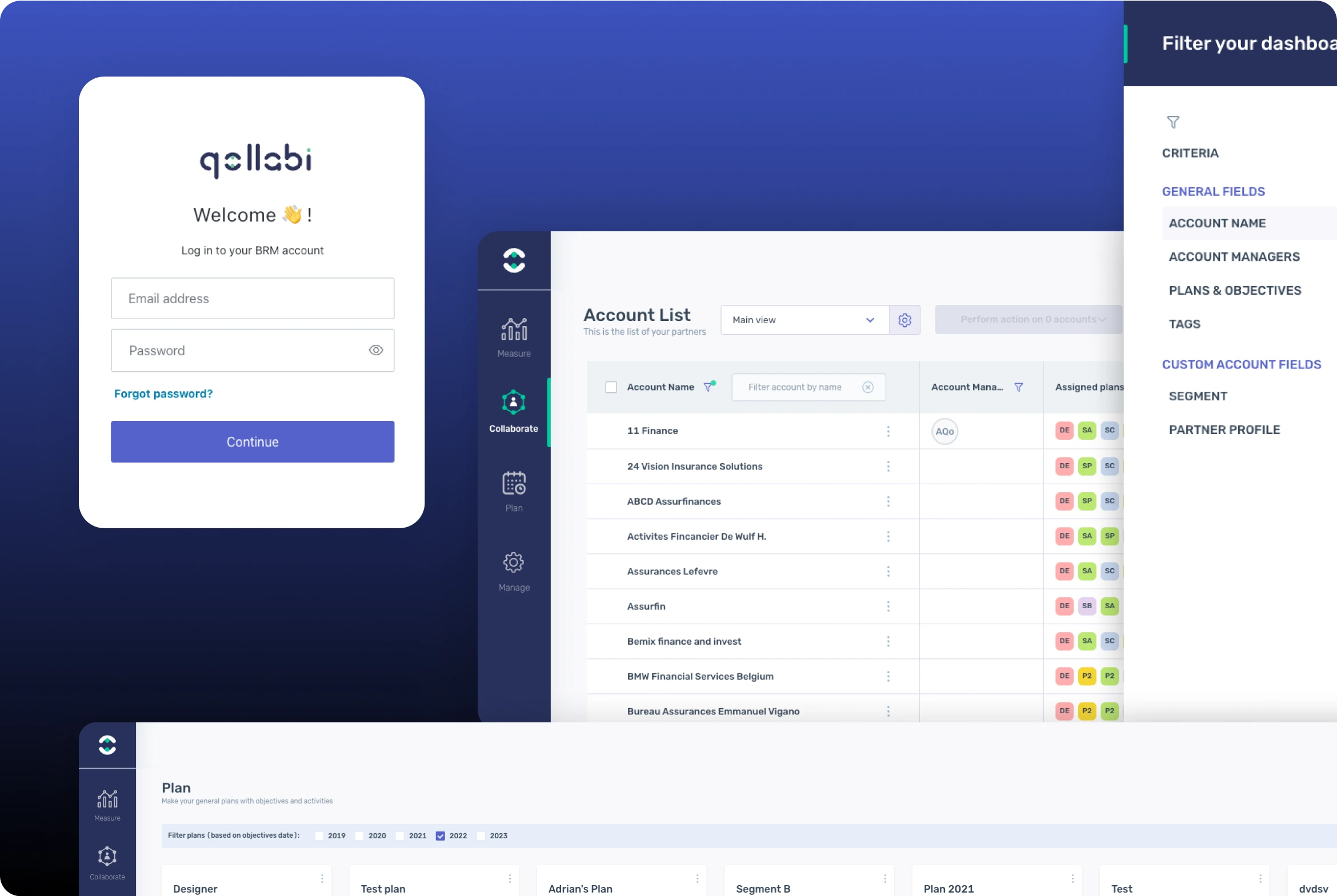
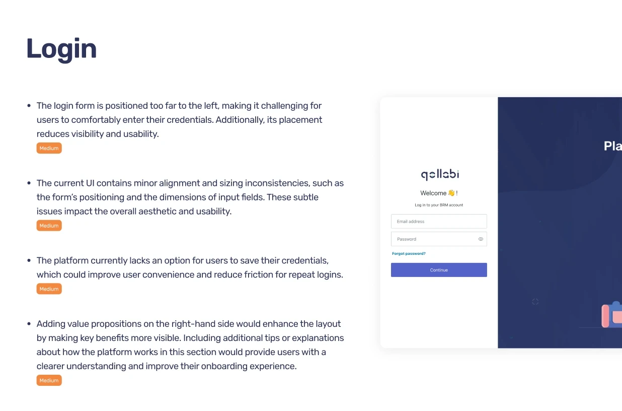
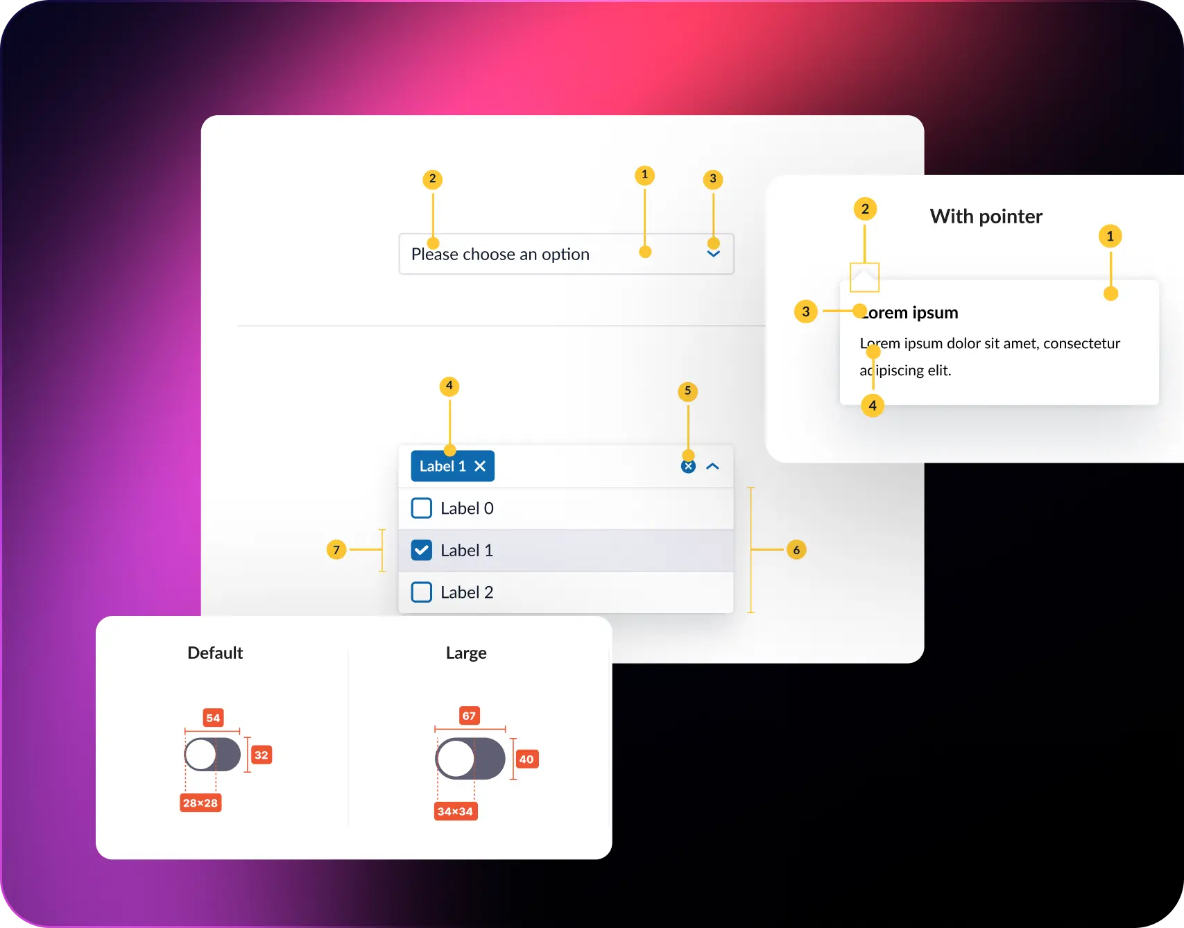
Login Form
Components
Team Education and Advocacy
Seamless Collaboration with Developers
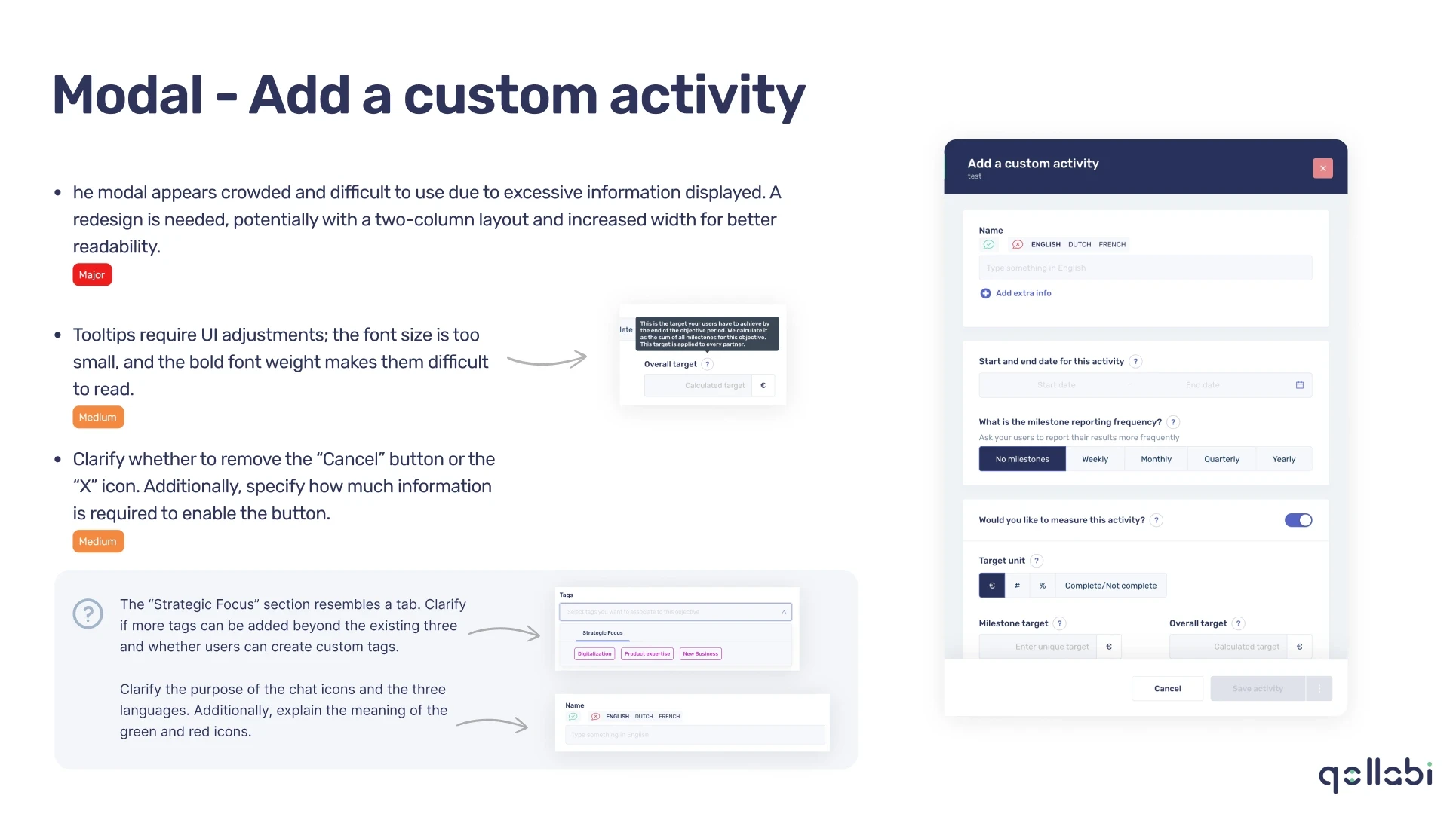
Modals
Columns View
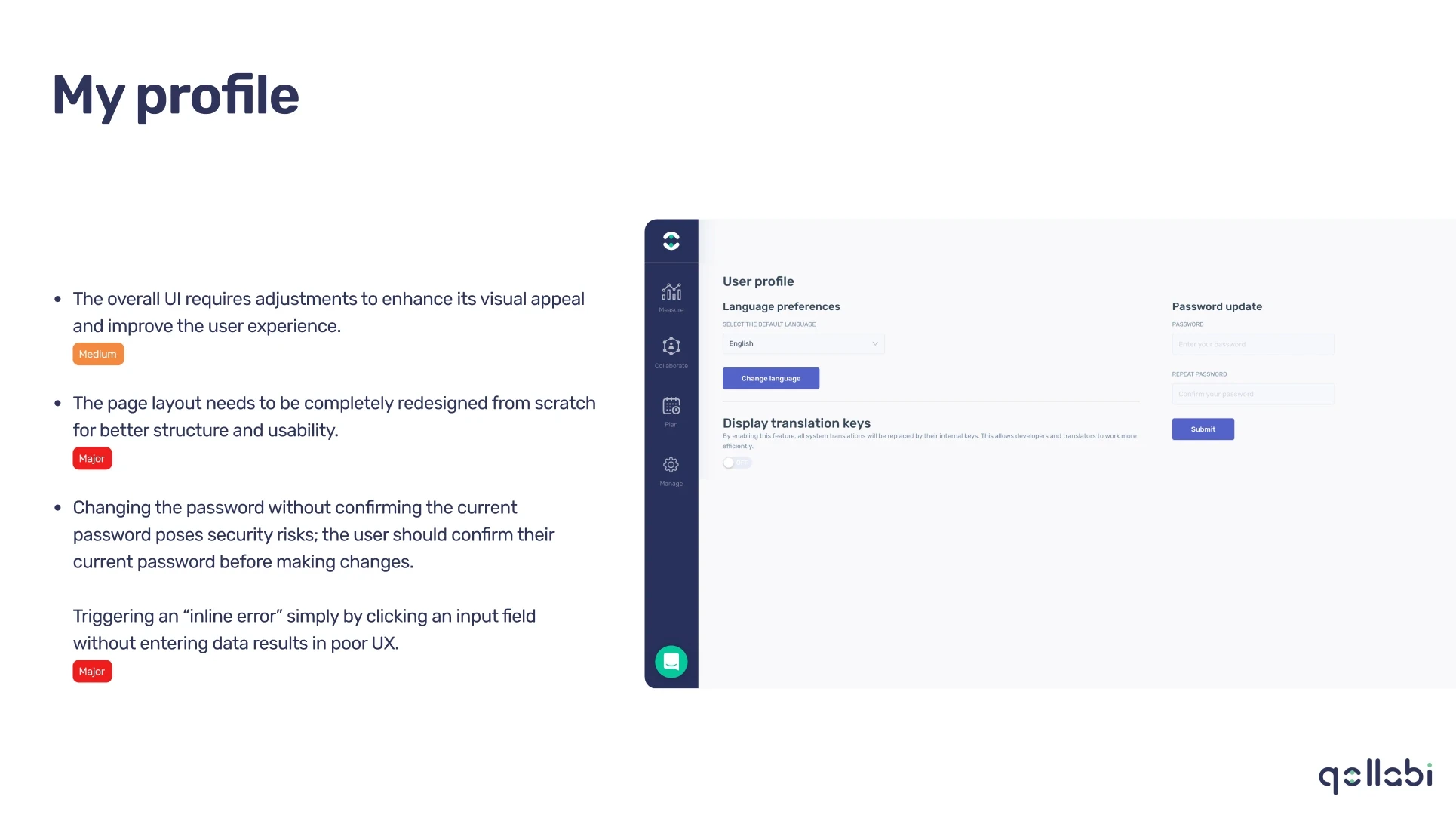
Account Details
2
weeks
34
pages
Process
Research & Discovery
Stakeholder Calls: Held discussions with the business team to understand platform goals, user demographics, and pain points.
Heuristic Evaluation: Assessed the platform using Jakob’s Heuristics to identify usability flaws and inconsistencies.
Accessibility Review: Conducted WCAG compliance checks to evaluate the accessibility standards of the platform.
User Feedback Analysis: Reviewed existing user feedback to pinpoint specific challenges and improvement areas.
Planning & Analysis
Component Assessment: Cataloged existing components to identify inconsistencies in styles, states, and behaviors.
Navigation Mapping: Mapped the platform’s user flows and information architecture to identify bottlenecks and redundancies.
Competitor Benchmarking: Researched similar platforms to identify best practices and opportunities for differentiation.
Redesign & Recommendations
Component Redesign: Updated input fields, dropdowns, buttons, and other key elements to align with WCAG standards and improve usability.
Information Restructuring: Suggested reorganizing modals, columns, and tabs for better clarity and reduced cognitive load.
Visual Consistency: Proposed updates to align the platform’s visual language and enhance brand identity.
Accessibility Enhancements: Incorporated actionable recommendations to meet at
least AA compliance.
Outcome
The redesigned platform effectively addressed the initial pain points while delivering a user-friendly and accessible experience. It combined intuitive usability with modern design principles, ensuring a cohesive and visually appealing interface that met accessibility standards and improved overall
user satisfaction.
Other case studies
BCR
Empower Your Financial Future
Pazanga
Full service marketing and PR for healthcare and life sciens.
Tamoil
Empowering fleet management with flexible budgets
BCR
Empower Your Financial Future